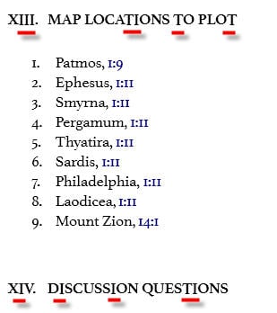
Bug: T's and I's descend too low in a particular size of heading
The bottoms of capital T's and I's (and possibly V's?) descend below the bottom of the line of text in an intermediate heading size (not sure if this is Heading 2 or what).
You can see it in this example from p. 185 of Bob Utley's New Testament Survey: Matthew - Revelation. See how the bottoms of the red underlined letters here don't line up with their neighboring letters?
Comments
-
This happens in a lot of resources. It's very evident in the ISBE.
I was thinking maybe it was another Windows XP font issue. What OS do you use?
MacBook Pro (2019), ThinkPad E540
0 -
Rosie Perera said:
The bottoms of capital T's and I's (and possibly V's?) descend below the bottom of the line of text in an intermediate heading size (not sure if this is Heading 2 or what).
This is a known problem with the hinting on the Athelas font that has been reported to the font designers.
0 -
Todd Phillips said:
This happens in a lot of resources. It's very evident in the ISBE.
I was thinking maybe it was another Windows XP font issue. What OS do you use?
Vista.
0 -
Bradley Grainger said:Rosie Perera said:
The bottoms of capital T's and I's (and possibly V's?) descend below the bottom of the line of text in an intermediate heading size (not sure if this is Heading 2 or what).
This is a known problem with the hinting on the Athelas font that has been reported to the font designers.
Cool. I hope they fix it. I was trying to train myself to ignore it but wasn't having much luck.
MacBook Pro (2019), ThinkPad E540
0 -
Interesting. It doesn't happen for me. Perhaps it's related to your screen resolution. I'm at 1920x1080.
This is my personal Faithlife account. On 1 March 2022, I started working for Faithlife, and have a new 'official' user account. Posts on this account shouldn't be taken as official Faithlife views!
0 -
Mark Barnes said:
Interesting. It doesn't happen for me. Perhaps it's related to your screen resolution. I'm at 1920x1080.
Perhaps. It's not a problem if I increase or decrease the font size, but it is at the default size, which is the preferable size unfortunately.
MacBook Pro (2019), ThinkPad E540
0 -
-
Rosie Perera said:
I'm now on Windows 7, 1920 x 1200, AMD Radeon video card, Default font, Default font size, and it's still a problem.
I don't see the problem on either of my computers (below), both with Radeon cards, 1366x768 & 1680x1050, and the same Default settings in L4. Makes me wonder that the "hinting" (whether optimal or not) is implemented/interpreted differently between graphics drivers/cards; even amongst the Radeon models.
Dave
===Windows 11 & Android 13
0 -
Dave Hooton said:Rosie Perera said:
I'm now on Windows 7, 1920 x 1200, AMD Radeon video card, Default font, Default font size, and it's still a problem.
I don't see the problem on either of my computers (below), both with Radeon cards, 1366x768 & 1680x1050, and the same Default settings in L4. Makes me wonder that the "hinting" (whether optimal or not) is implemented/interpreted differently between graphics drivers/cards; even amongst the Radeon models.
I tried it at 1680x1050 and it had the same problem (but my screen looks blurry at that resolution so I couldn't live with it anyway). I have a SyncMaster 245T 24" LCD monitor. The 1366x768 resolution isn't even available for me and the ones around it and lower wouldn't take advantage of my screen size so I'm not going to use them.
The AMD Radeon that I have is the HD 6900 series. I have the most up-to-date driver.
Incidentally, this probably doesn't occur everywhere that there's upper-case text, only when it's in certain font sizes in the document, for example in this screenshot there's no problem with the larger heading, or the T in "OT" or the V in "Vocabulary" in body text, but both the V and T descend too low in the medium-sized heading.
0 -
Rosie Perera said:
Incidentally, this probably doesn't occur everywhere that there's upper-case text, only when it's in certain font sizes in the document,
Here you go (Laptop) - subtle with letters but noticeable with the period in Holman NT Commentary: Luke (p.290)
But almost perfect on the Desktop @ 1680x1050
Dave
===Windows 11 & Android 13
0 -
Bump. This is still bugging me. What is the status report from the Athelas font developers? Are they going to fix it?
Another problem they should fix while they're at it is that the apostrophe is too low:
Compare this to what it looked like in Word (I'm making a PB):
Why, oh why, does Logos's rendering of this have to be so UGLY? [:'(]
0 -
Rosie Perera said:
I agree with your sentiments, Rosie. It irritates me every time I open an encyclopedia.
MacBook Pro (2019), ThinkPad E540
0


