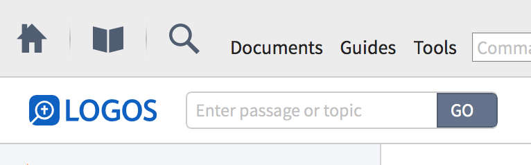
Anyone else notice this change in the Logos logo?
Nope. But,as usual, I don't like change. [:(]
It is softer, rounder and less formal. Reminds me of Google changing their font.
I moved this to the beta forum, since this hasn't been rolled out to everyone yet.
I noticed it in the iOS app and now the beta. I like the change personally.
Thanks Phil. Personally, I think it looks good!
I moved this to the beta forum, since this hasn't been rolled out to everyone yet. Thanks Phil. Personally, I think it looks good!
impersonally, I find it good, too. (saying to no one in particular)
. . . at least I got a chuckle out of that. I have no idea what it means. But I do like the font.
Typefaces come and go, but the word endureth forever..
Reminds me of Google changing their font.
It looks fine to me. But it's a fad. I dislike fads almost as much as Lou Grant hates spunk.
I noticed it, but it causes no harm, so didn't give much thought to it.
Available Now
Build your biblical library with a new trusted commentary or resource every month. Yours to keep forever.