Logos, I'm quite impressed with all that is present in this release. But alas, I've already found one quirk. Not a serious issue, but an inconsistency in styling.
I notice differences in font smoothing from one resource/tool to another, and sometimes within the same tool. Notice the screenshot below - a search set to grid view and the same search set to verses view. Looks like quite a bit of difference in the aliasing. Notice similar quirks in the passage guide.
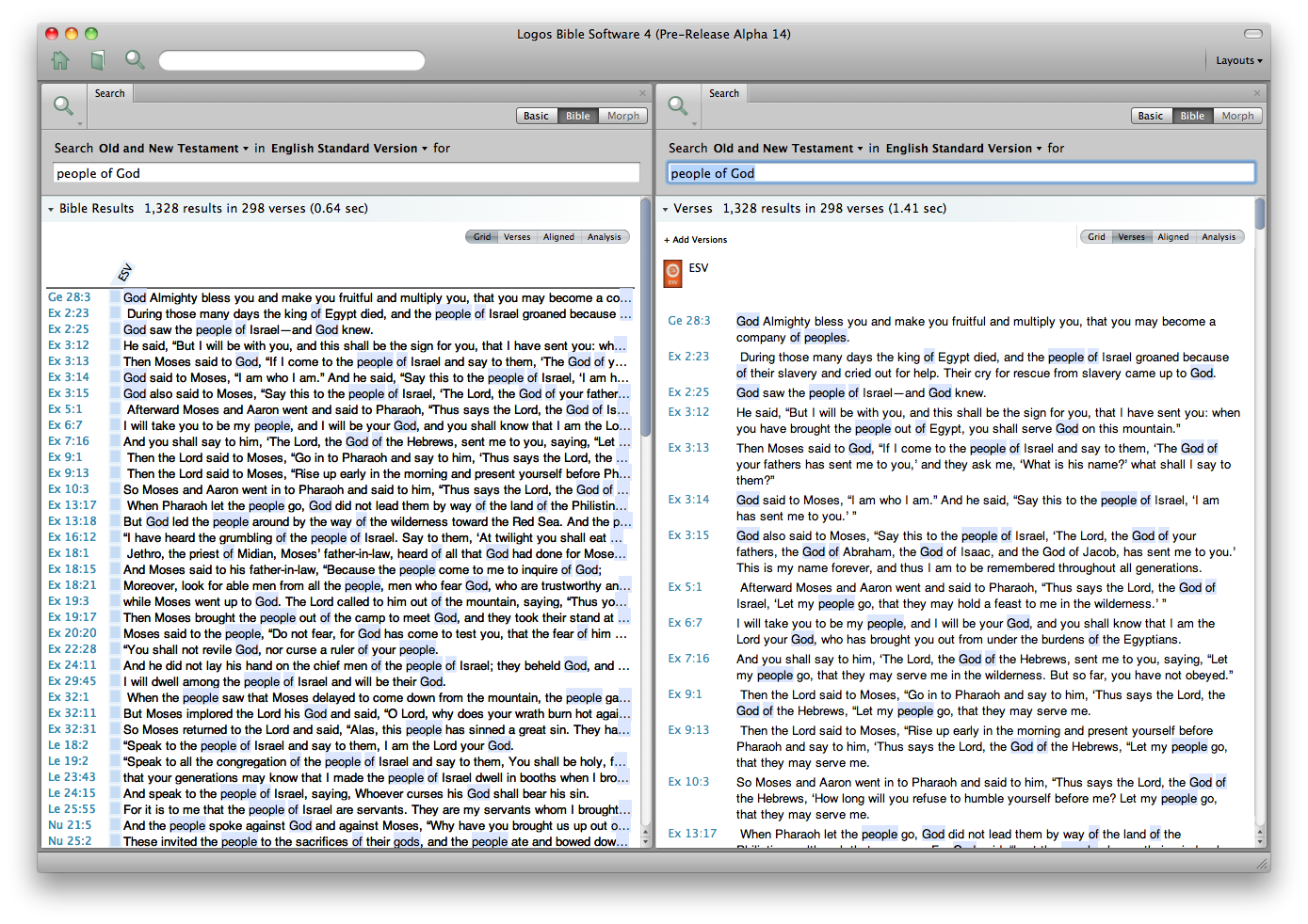
This is running under Snow Leopard.

