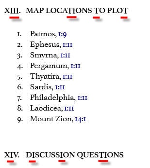
The bottoms of capital T's and I's (and possibly V's?) descend below the bottom of the line of text in an intermediate heading size (not sure if this is Heading 2 or what).
You can see it in this example from p. 185 of Bob Utley's New Testament Survey: Matthew - Revelation. See how the bottoms of the red underlined letters here don't line up with their neighboring letters?
