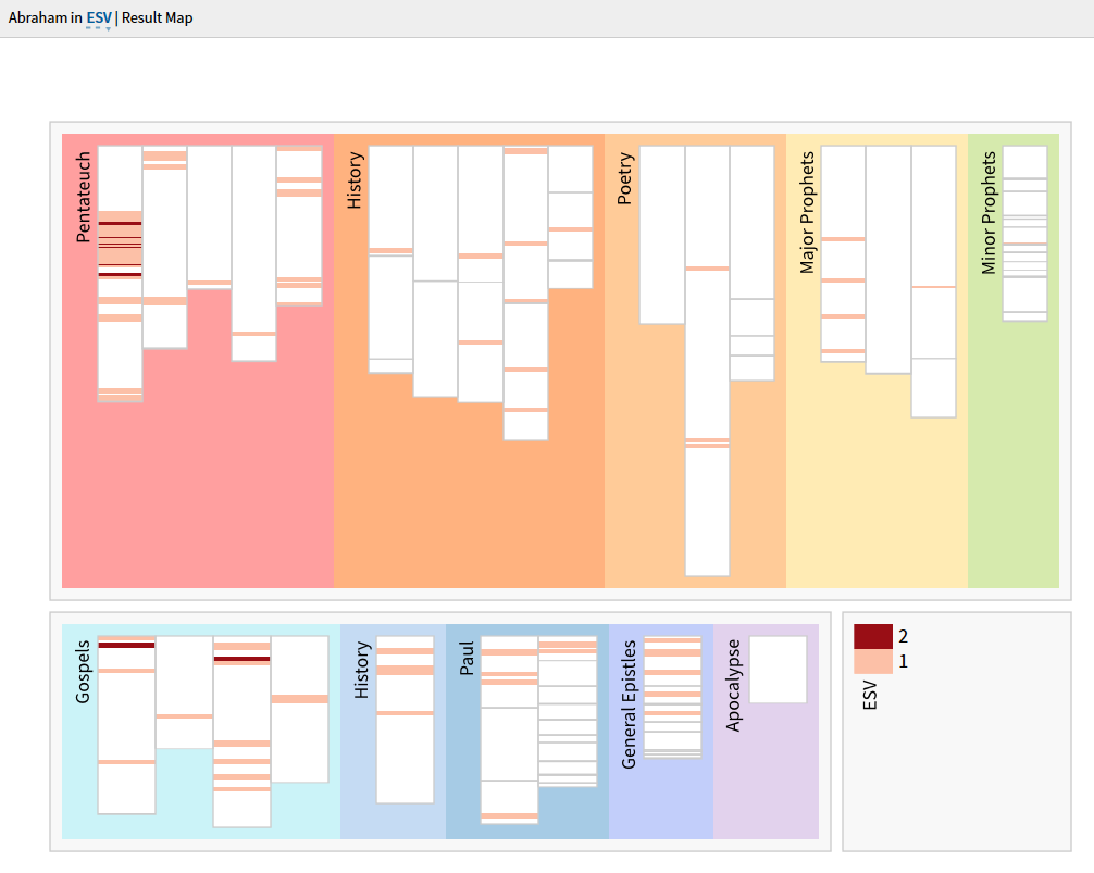
Good Day - does anyone know the meaning of the color-codes on a Result Map?
There are two colors for ESV at the bottom Right. If there is any meaningful reason, how can I take advantage of it?
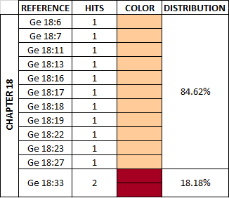
The colour codes mean that (in this example) there are one or two hits in the same chapter. (You will see different colours/shades if you search across more Bibles or for a more common term.)
Thanks for the Pointer Bradley. Isn't it rather 1 or 2 hits in the same verse?
I do understand the frequency distribution in the complete map, but what does the thickness of a line correlate to? I don't understand how to read visual information presented by thickness in this graph in a productive way.
Thanks for the Pointer Bradley. Isn't it rather 1 or 2 hits in the same verse? I do understand the frequency distribution in the complete map, but what does the thickness of a line correlate to? I don't understand how to read visual information presented by thickness in this graph in a productive way.
Thicker bars just indicate there are multiple adjacent chapters with hits. For example, the first book (being Genesis) is split into 50 different segments, one for each chapter. Each segment is color coded according to how many hits there are in the chapter. White for none, pink for 1, and red for 2.
Thanks Andrew & Bradley,
This is how I understand your explanation:
If this is correct then it would be great if Chapters could be framed with maybe a thin black border to make this division visually communicate information. This is if the philosophy behind data visualization is to represent insight.
Possible Insights to name a few:
Maybe I'm trying to see to much in the Result Map - but then again - this would be a small but great addition to the usefulness of the Result Map.
Available Now
Build your biblical library with a new trusted commentary or resource every month. Yours to keep forever.