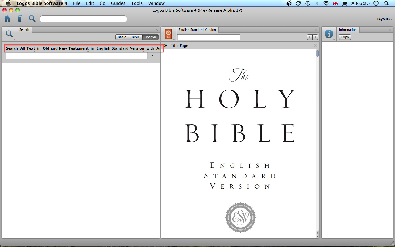
I'm only running L4 on a Macbook and not on a desktop machine (my wife and I sold our iMac about a year ago and we've now got a MacBook each). I'm running into a problem in a couple of areas where L4 requires so much real estate that it punishes those of us with smaller screens. Consider, for example, the screenshot below. I've not cropped it down so you can see how I've laid out the whole screen. I don't believe that I'm cramming too much into one view here, but I cannot really see the options for the morph search (highlighted):
I believe there are two possible solutions to this problem:
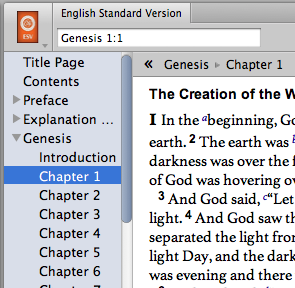
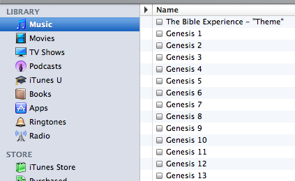
1. Reduce the font size. I know this will be unpopular with some users, but compare the two screenshots below. One is from L4 and the other from iTunes. You can see that L4 consistently uses larger font sizes that the rest of the Apple UI. I understand it is important that a larger font size is an option, but I believe that the default size should be more consistent with the remained of the UI. It feels like L4 'wastes' screen real-estate:
2. Consider how the finder implements search options. The initial view of the search window is very simple, but you can keep adding lines of complexity as needed. So for example, in the case of L4 we don't always need to use the Markup Selector because the default 'All Text' search is what we want, but it's there in a prominent place in the window taking up valuable pixels:

