I don't know how many times I've done this! (Windows version, L8.5 and prior versions)
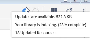
I hovered over the (3) icon [or whatever number of notifications I have] in the upper right, saw "Updates are available", tried to click on that (forgetting that it's not clickable), and got frustrated that it wasn't a clickable link (either the popup disappeared before I could click, or my click actually went to the (3) icon itself). So then I have to go and actually click on the fool thing.
And the popup that shows what all those (3) items are often covers over most of the icon making it harder to click on.
This is such a weird/frustrating design. Why have two different versions of the popup that comes up to describe what those notifications are? One that just abbreviates them, and one that is clickable? I suppose it's maybe for speed, so that an accidental hover over the icon won't bring up the whole thing that might take longer to generate. But if that's the case...
Could you please make sure the abbreviated popup never covers over the notifications icon?
