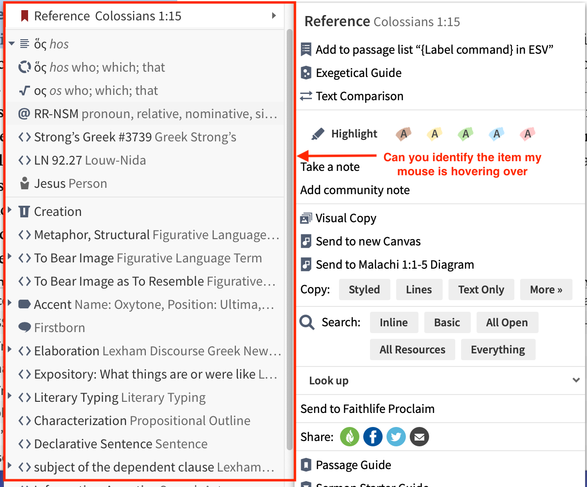
When hovering the mouse over options on the left side of the new context menu the item that the cursor is very lightly highlighted when the mouse is hovering. I would prefer it be shaded or highlighted in a more pronounced way.
Looks to me like you're on the morphology line, but I agree that it would be good to be a bit more distinct.
Available Now
Build your biblical library with a new trusted commentary or resource every month. Yours to keep forever.