I wouldn't report this in the alpha phase, but now that we are beta and I presume that polish will be applied, I'll report the following in case it hasn't been noted yet.
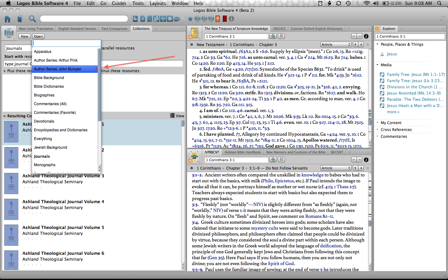
When you click on 'open' in the collections window, the dialogue box needs adjusting so that the 'remove button' is not half covered by the scroll bar. (see below next to the arrow)
Hope this kind of feedback is helpful.