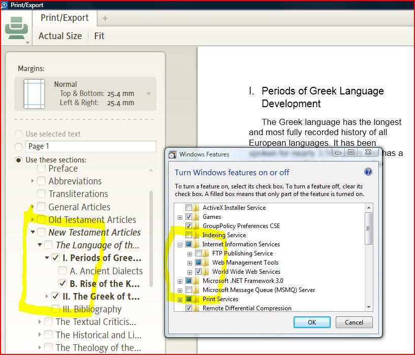
So far, I like the new Print Preview "Use these sections:" as a way of controlling what to include.
HOWEVER, I am used to some applications, a select/unselect of a higher-level to then include all below. Also, if only some of the lower levels are selected, the higher-level boxes are shaded, rather than plain ON or OFF.
Is it possible this design could act more in keeping with what is "normal" in other applications?
For those that know, what is the "normal" way an Apple application would tend to work for this kind of UI?
What do others think?