Nelson's Complete Book of Mable Maps and Charts (Revised) has significant layout problems. For example:
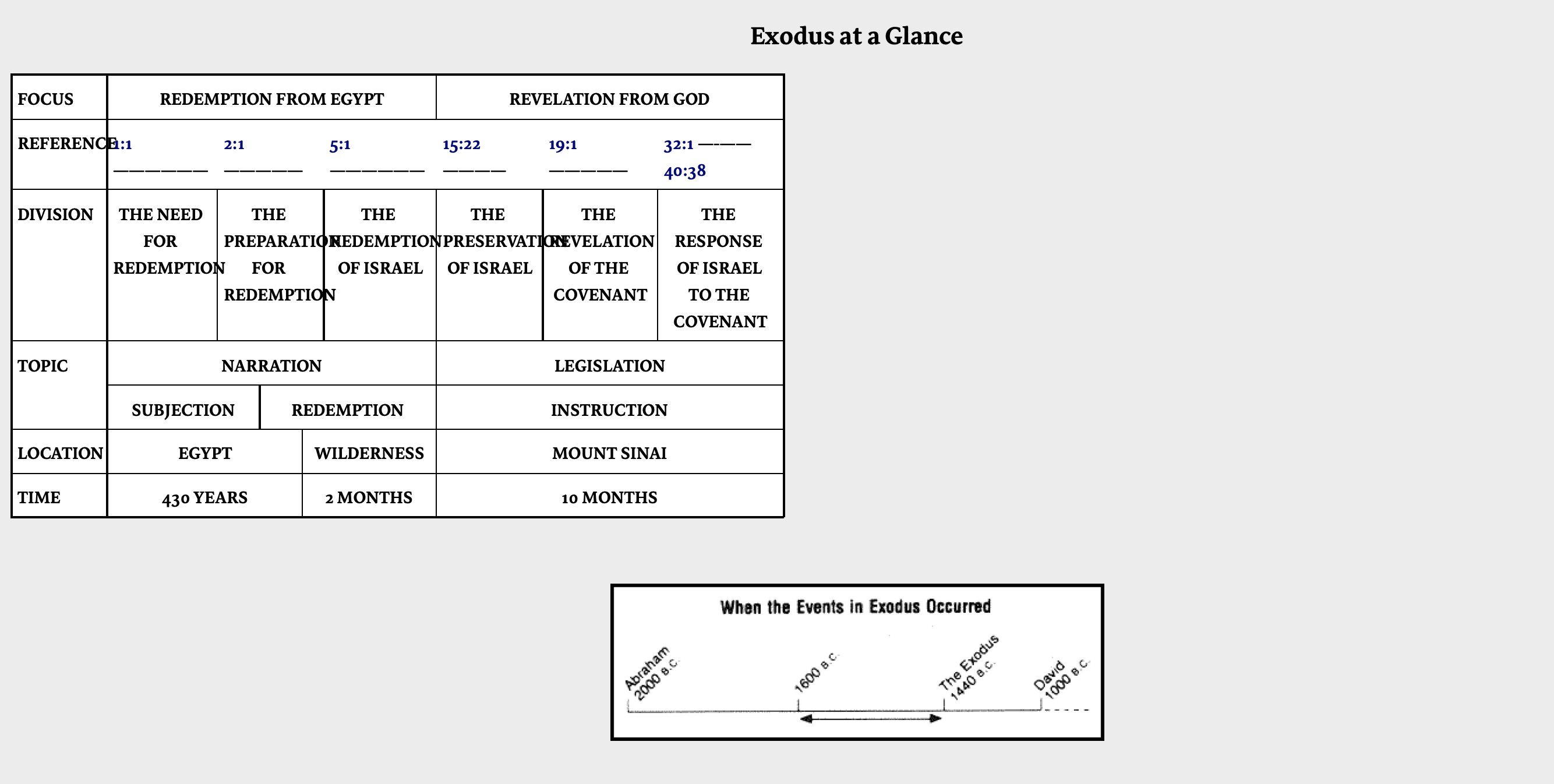
Even reducing my font size to the smallest setting for the resource will not fix the problem of the words overlapping and exceeding cell boundaries:
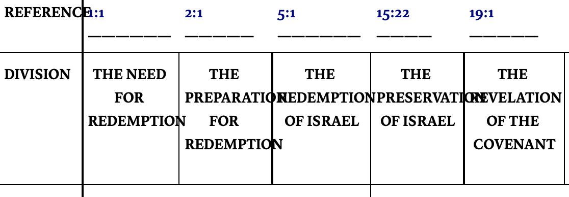
If it were just an e-book, I wouldn't be surprised, but as a Logos Research Edition resource, shouldn't the quality of the charts be closer to standard expectations? If somebody has a hard copy, would you please confirm if some the charts are this bad in the printed version?


