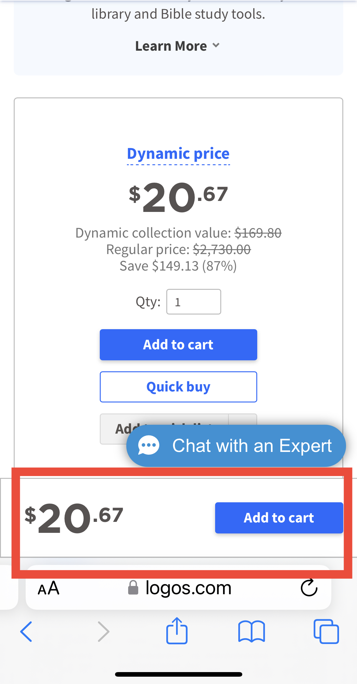
There’s a new banner that says Add to Cart that’s showing at the bottom of the webpage on my iPhone. It is redundant because there’s already an Add to Cart button underneath the resource picture. It’s annoying and you won’t convince me to buy a resource just because it has 2 buttons that say “Add to cart!”
Thanks!
DAL
Here’s the annoying picture!