The width is a great detractor as the image + text is scrunched up.
Note: these screenshots were made after the comments and disaster below.
Any attempt to widen the bar is a disaster (see my Bug thread).
But if it is only giving me the top Commentary and Study Bible, I will use my Linkset and Parallel Books any day:
- better readability (two panels)
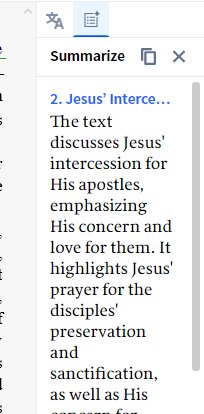
- I can use Summarize on the Commentary & Study Bible
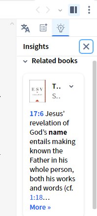
- It is more relevant to the passages being studied i.e. Jn 17:6
- the Study Bible was stuck on Jn 17:13 when the Commentary was summarizing chapter 17.
Then "Something went wrong...." (Summarize), and Insights showed three large animated dots. It eventually displayed "We couldn't find anything in your Library on Jn 17:6" and tried to give me a link to "A bigger library" at logos.com (v.6 is at the top of the panel).
============================
After the recovery
The Insights sidebar corrected itself wrt, passages being displayed.
The screenshots show that the Insights sidebar (and image) wastes horizontal space compared to the Summarize sidebar (about 0.4 cm on my screen).
So more attention to usable space would be appreciated, together with a consistent font/size (I prefer Insights).
If the width sizing bug is also fixed, I could change my initial opinion.


