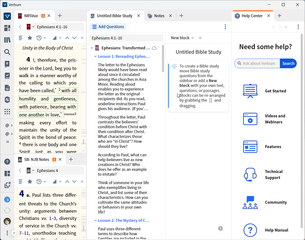
I like the idea of making the help center more "in your face" but I don't like the degree to which it scrunches the other columns. Could it be reduced from a "half" column to a third or quarter column?
I like the idea of making the help center more "in your face" but I don't like the degree to which it scrunches the other columns.
But why have it when Help Centre button is in the main app toolbar, after which it will be very visible in the layout?
when Help Centre button is in the main app toolbar, after which it will be very visible in the layout?
I suspect that they are targeting new and low-expertise users; we know from questions in the forums that they often fail to use the Help option hence, the in-your-face approach. I haven't played with it sufficiently to figure out how much it can be reconfigured by the user.
In a future beta, the Help Center will display help about this specific layout to help users get orientated.
Available Now
Build your biblical library with a new trusted commentary or resource every month. Yours to keep forever.