In relation to the rest of the Dashboard, I find the color scheme of the Get Started card to be garish and noisy (and reminds me, quite loudly, why I have the entire Explore section turned off). I also find it very intrusive in my dark mode haven. Is there any plan to integrate these colors to match the overall palette of the Dashboard?
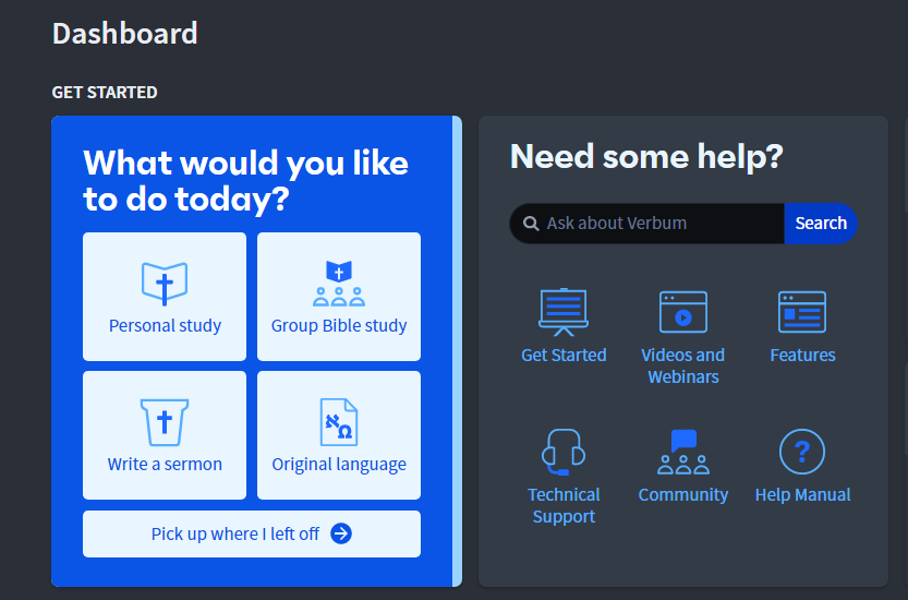
(Yes, I know I can turn if off, but I would prefer to not have to. In any case, of the two cards, the Help Centre card is the one I'm more likely to use frequently, so I'm thankful it won't be constantly waving an attention-seeking flag in my face, and I won't have to consider turning it off as well.)
