I use Logos a lot in my classroom and in my research. A lot. But this latest update makes me want to call down curses upon the software. I don't think there are any solutions to these problems without the programmers making changes that I doubt they'll make. But these things are severe enough that I am considering significantly downgrading my use of Logos in my courses and teaching my students to use other resources. I did send a list of these problems to Logos but never heard back. So I guess I'm posting them here in the hopes of finding out that I am not alone in my deep frustration with how much this "new and improved" version of Logos has negatively impacted my teaching and research workflows.
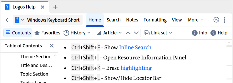
1. Ctrl+i — This shortcut no longer works to bring up the information page about a resource. I found this out in the middle of class this week. I will often show my class a resource in Logos and I (used to) use ctrl+i to bring up the information page so they could clearly see the book's cover image, title, author, date, etc.
2. Hebrew text in the navigation box of lexicons is now immensely smaller and the letters are more compact (closer together). It was already difficult enough for my older eyes to read the previous text size - especially where vowel pointing is involved - but now it's near impossible. And when displaying my screen on the huge classroom tv, even my students (with young eyes) have complained about the "new and improved" Hebrew font in that box.
3. Things that previously required a simple one or two click process now require three times as many clicks. E.g. I often briefly bring up the left side bar with the book's table of content to quickly move between chapters. It used to open with a simple single click on the left side of the window's toolbar. Now it's home—contents—then home again to make the cluttering second line of the "new and improved" toolbar go away again. Similarly, linkset was two quick clicks. Now it's four.
4. The arrows to go to a neighboring section/entry are also now hidden under 'home' instead of on the toolbar. I used to use those arrows all the time — especially when using lexicons in class. The ease of moving between lexical entries - especially when dealing with homonyms was so very easy and quick. Now it's not. With how much visual clutter is now on the toolbars, surely putting the arrows back won't add any significant visual clutter.
5. I use a lot of resources in Logos and my standard layout has five windows open. The new layout creates unnecessary visual clutter that is repeated five times on my screen. The previous buttons (as enigmatic as their meanings were) were smaller and they were also in a gray font that did not stand out as much amidst all the other data on the screen that I was processing. Now, the new toolbar has the much clearing words - but the font is black - the same color as the content that I'm processing across five windows. And now each of my five windows has a very very very annoying blue "new" bubble that assaults my vision. Thankfully, I did finally figure out how to make the second row of the toolbar not constantly present, but now I also have to close it every time I have to open it. I need the screen space for the resources, not an unnecessary toolbar….on each of my five windows.
I have already begun using Bibleworks more frequently in class to avoid some of these problems. I have the primary lexicons in that program and most of what I need. And I am starting to look into alternative assignments and resources that will allow me to diminish my use of Logos in my classroom. As for when I need to use Logos for my own research…well, I've taken to closing my office door so no one can hear me grumbling.
I already had to find a work around (using autohotkey) to disable the non-optional Logos shortcut of the right and left arrow keys changing your resource. That was frustrating enough. (The number of times I accidentally hit an arrow key while displaying the Hebrew text…only for the class to find themselves suddenly looking at Polycarp Greek!!) But these problems are not things that I can find work arounds for — especially the tiny Hebrew font. At the very least fixing the Hebrew font in the navigation box is imperative. For the other — it would be lovely if Logos would allow us to create/adjust shortcuts according to our own workflow needs. I need ctrl+i back. And if there were shortcuts I could use to not have to use the new toolbar to do things I frequently do, at least my workflow could speed back up. (And also, the blue bubbles need to be booted off the screen with extreme prejudice.)
(And, yes, I have the list of the Logos shortcuts. But, no, they are not sufficient for what I mentioned above.)