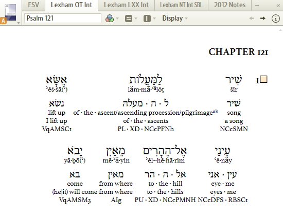
The line spacing on the Lexham Hebrew Interlinear is still not quite right. The vowel pointing on the Hebrew manuscript line conflicts with the transliteration line below it. This makes it hard to read the lines.
In addition to fixing this problem, it would be nice if we could color code the various lines to make it easier to read.