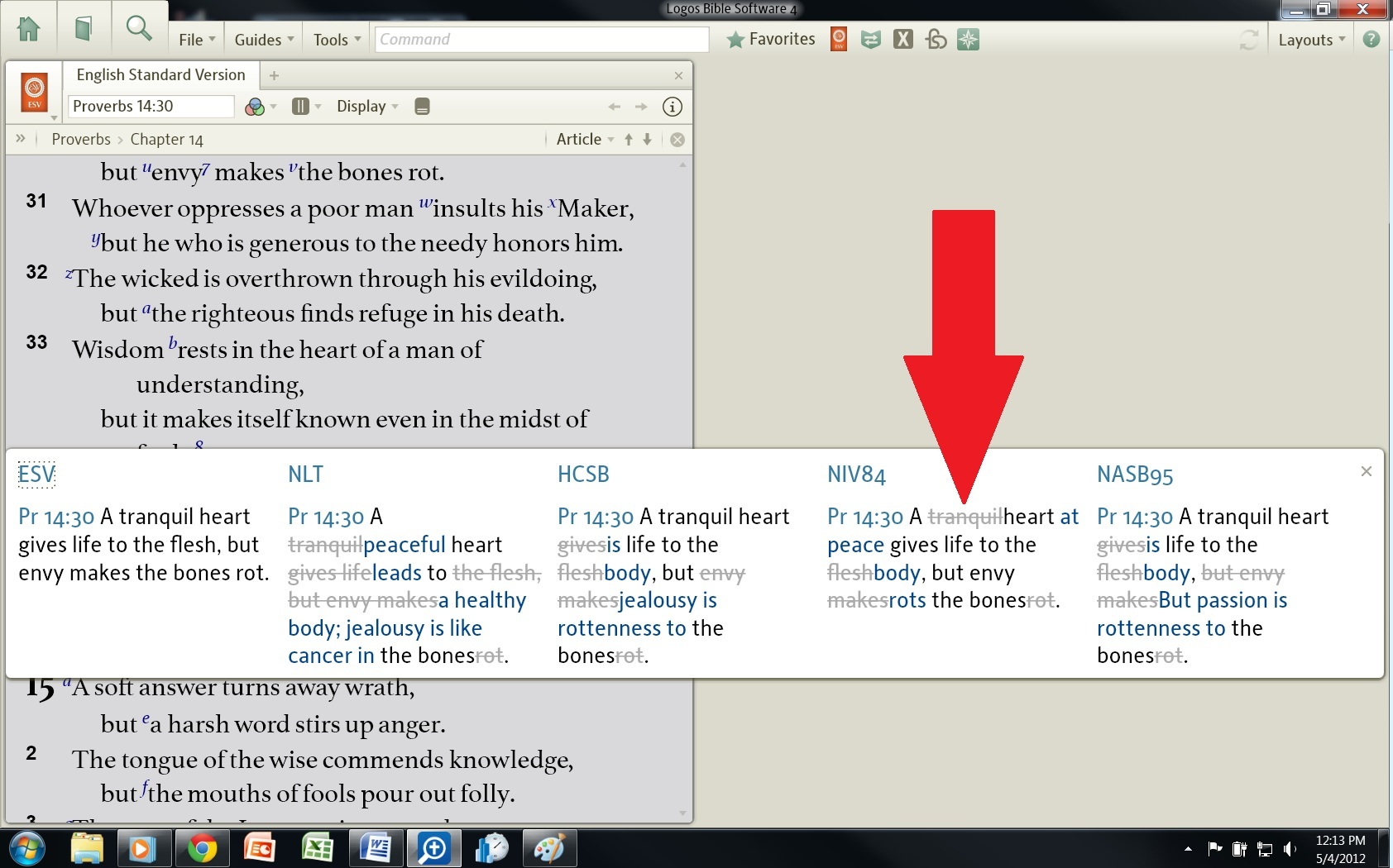
I was reminded while reading this thread, that comparing Bible versions with F7 displays changes that (to my very weak eyes) appear almost identicle... the strike-through words are displayed in gray, the words that are the same as my base version are in black, and words that differ from my base version are in dark blue.
I seem to recall that the old Libronix used high contrast colors like pink and baby blue to highlight differences. Does anyone know if we can change our font colors in L4? If so, please tell us how... Here's a screen shot of my F7 comparison: