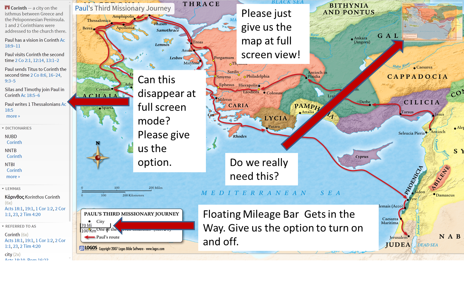
The Logos Maps are too cluttered. I like the old way when the full screen mode is used we had just the map itself that we could zoom in and out. I see no use for the smaller map is the right corrner it it destracting and gets in the way. The milage toolbar is nice but can get in the way at times. Please give us the option to turn off. Especially give us the option to toggle off the map information on the left side of the page. When full screen mode is used I would just like the map and nothing else. As a Pastor when presenting a biblical location on the screen it is helpfull only to have the map itself and nothing else. Anyone else agree?
