I started reading The Ante-Nicene Fathers, Volume I and found the column layout to be so bad as to render the book unreadable. Has anyone else seen this problem?
Sean, can you post a screenshot to show us what's wrong with it?
Yes, a have the same experience. it's ugly on the desktop, unusable on the iPad. Here is an iPad screenshot:
I should have mentioned that this is not on every page. Just on those pages in the source text where columns are employed to show more than one version translation) of the text.
That is the screen shot I've posted above.
I don't know very much about this resource, but this is what I'm seeing on the desk-top:
I should have mentioned that this is not on every page.
Maybe I just haven't been on these pages yet, but I have been working extensively with the resource and haven't had this problem before. However, when I opened it on my iPad, I see it just as you have it on the screen shot. I upgraded to Logos 5 and ever since I have been having problems with my iPad app. I'm wondering if there are some bugs in 5 causing this? Do you have 5, 4, or another version?
I have Logos 5.x ... Whatever the current service release is. Verbum 3.2.3 on iOS. I don't have a screen shot from version 4, but I want to say it has been this way for a while. I know the resources themselves were updated last year sometime. Not sure if anything changed with that.
Even for me, the column spacing on the desktop is not wide enough. It appears on the other attached screen shot that it is ok but when you look at it full screen in front of you it's too narrow. My opinion.
@ Sean,
This is what I get...
mm.
I am bumping this as a problem that needs to be addressed. I got the Fathers as part of the Black Friday sale, and I am now in ANF and the two-columned Epistles of Ignatius. There is hardly any gap between the shorter and longer versions, making them extremely difficult to read. Android and biblia.com are impossible; here's a shot from biblia, which is representative of others:
The only layout that I found on L5 desktop that makes them passably readable is with the book maximized (but not in reading view) with columns set to none:
This has the disadvantage of not being able to see the footnotes onscreen or view other resource simultaneously.
Volume I and found the column layout to be so bad as to render the book unreadable.
Well I could read it but agree that the layout is not good.
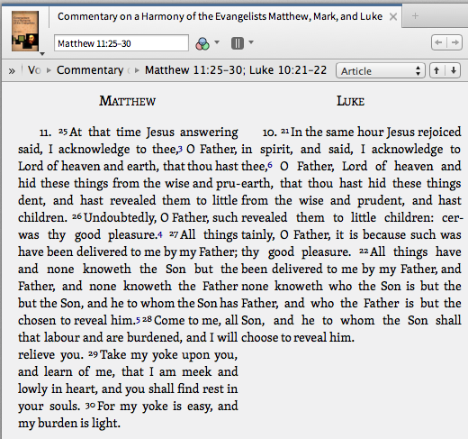
The same problem occurs with Calvin's Commentary on a Harmony of the Evangelists Matthew, Mark and Luke. The first time I tried to read this resource I thought there were serious translation problems. It took a moment for me to realize that it was actually a layout problem. We need more space between the columns dedicated to each gospel in the Calvin resource. Here's a screen shot from the iPad version:
And a partial screen shot from L5 on the Mac:
We definitely need more "breathing room" between columns in order to be able to read such resources comfortably.
I agree. It seems this has been out there for a while and it applies to certain resources and not others. I'm not able to use the particular resource I mentioned earlier this year for reading. There is literally no space between columns in some sections of the book.
So... How do we go about reporting this and getting some help in fixing it?
First, you could start a thread in the Logos 5 forum and prefix the title with BUG: This is more likely to get the attention of someone from Logos than this thread.
I've created a case to re-evaluate the layout of these resources.
Thank you Alan
Available Now
Build your biblical library with a new trusted commentary or resource every month. Yours to keep forever.