I have posted on this during the beta, but I thought I might as well petition for it again.
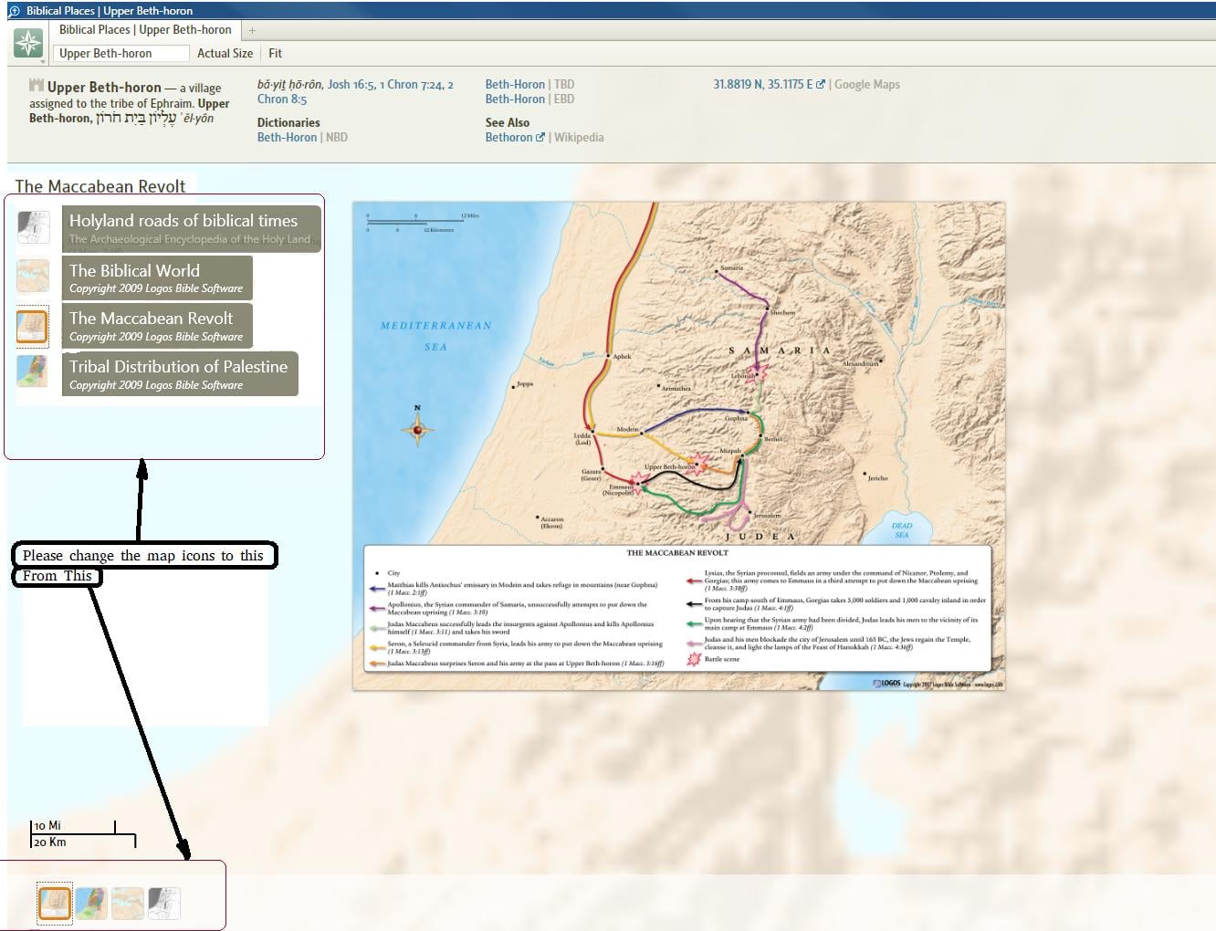
I find the UI for the biblical places, people and things tools to be unusable. The icons along the bottom are too faded to see and you have to click or hover over on each one to see what it is.
Please consider changing the UI to be like this, with the list down the left hand side with the text title you can see without having to hover over each icon. The interface currently is barely usable if there are 1-5 icons on the bottom. When there are dozens and dozens it becomes a crap shoot as to if you can find something (Jerusalem puts 75 icons along the bottom.)
The list would be dynamic and sorted alphabetically. The list should be hideable (<<) so that you can maximize the display area. The list should scroll if there were more icons/things to show than could be fit on one screen. The icons should be darker so that you can see what is on them. The current behaviour of when you hove over an icon presenting a slightly larger map would be nice to keep
Thanks,
Clinton