With 5.3b1 the new capabilities in the visual filter menus provide a left-click dropdown menu to invoke the various options
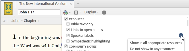
In the 5.2b stable release, available options were accessed via a right-click menu
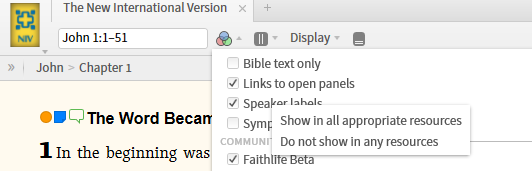
From a usability perspective I think the right-click option is better. Any reason this new menu approach was adopted?
Thanks, Graham