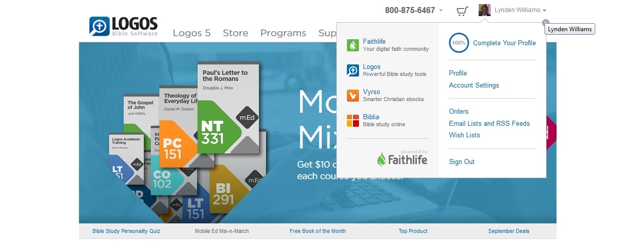
The links are gone from the top of the page. They are now located under your acount.
I have noticed that also. I generally use the Logos home page and then jump to the Forums, Vyrso, etc. It is now no longer that straightforward.
They are now located under your acount.
The Forums link isn't though. It's only found in the Support menu.
Logical place for it to be. For the first time user, no problem. For those accustomed to looking to the top of the page? [:@]
I'm good with it as it is.
Change is good!! Embrace the change!! Without change we would nit be God's Kids!!
Bless!!
I knew I couldn't be the first one to notice this. There is...*ahem* was...a perfectly good reason for those things to be where they are were. They are in a highly utilitarian spot that reduces the need for unnecessary mouse work. The new "design"...not so much. Like Yeishuu`a, I prefer and advocate the old way. Lk. 5:39 NIV
They are now located under your acount. The Forums link isn't though. It's only found in the Support menu.
I find this annoying. I get to the forums through the Logos home page too. Now it's an extra mouse click and hover-and-find-the-menu-item away. I don't have space on my browser toolbar for another shortcut button. Plus it breaks the nice consistency that had developed between all the Logos sites. I'm sure this is part of the move towards the new Faithlife branding, to avoid a proliferation of links up there. But I'd like to register my dislike of the change. I do embrace most change, but this one is annoying for frequent Forum visitors. I'm becoming less and less of one lately, though, so I guess it doesn't matter all that much in the grand scheme of things...
There's a nice link to the forums at the bottom of Logos.com in the first section entitled "Logos Sites".
That's even worse than using the Support menu. Have to scroll twice with my mouse scroll wheel to get down there, and then move my mouse pointer down to the bottom of the screen from where it was when I just clicked my Logos shortcut icon.
I get that far on the home page once or twice a year when I get curious how many sites of been added since I last bothered to look ... or to update the Reading LIst
find this annoying. I get to the forums through the Logos home page too. Now it's an extra mouse click and hover-and-find-the-menu-item away. I don't have space on my browser toolbar for another shortcut button. Plus it breaks the nice consistency that had developed between all the Logos sites. I'm sure this is part of the move towards the new Faithlife branding, to avoid a proliferation of links up there. But I'd like to register my dislike of the change. I do embrace most change, but this one is annoying for frequent Forum visitors. I'm becoming less and less of one lately, though, so I guess it doesn't matter all that much in the grand scheme of things...
Rosie
You have articulated my feelings exactly.
… as for Dan's handy tip – both MJ and you said it! It is harder to scroll plus I hardly ever look at the bottom of the page.
[:(]
Every blessing
Alan
I think everyone should add a bookmark to the forums. Then it's only one click!
I have bookmarks to both the Topics page and the Your Discussions page.
Plus the internal forums navigation has always been fairly poor, so bookmarks bypass all that.
Good web design helps guide people along a path and minimizes distraction. Based on our data, the family bar was a distraction for many. We understand that it was a convenient tool for navigating to our family of sites for some. We weighed the pros and cons and decided to experiment with no family bar. The data will tell us whether we made the right decision or not.
In the meantime, there are plenty of really easy ways to jump to the forums:
Keyboard shortcuts are often way faster than using your mouse anyway.
Assuming your hands are on or near the keyboard :-)
The net result of this for me is I am going to replace the Logos Home Page short cut on my tool bar with a shortcut to the forums, since I visit the latter far more frequently. I don't think this is the type of behavior you were aiming for! Wish you the best on you new design, not working well for me.
Does option 1 not work for you? If so, can you help me understand why? What's not working for you with the new design? Is it just that it's different?
Do you not have room for two shortcuts in your toolbar?
I use a single short cut to the forum link that doesn't have all the forums listed. From thense, Logos.com, etc. It saves me a lot of unnecessary expensive rabbit trails among the book shelves. So I'm guessing that was Logos' aim, trying to save customers money.
But while testing out Phil's hovering (on an iPad), I accidentally clicked on the 'programs' at Logos. I assumed they'd be co-ops with seminaries, pastor participation, bicycle repair in Bellingham, etc. similar to Target's programs. I never dreamed it'd be 'books'. But maybe that was also the goal. Too much customer purchasing can be a real headache.
Hi Phil
Hover on Support; click on Forums. It's still just one click away, even if a quarter of a second longer than before.
Just to point out that this "hover on support" mechanism doesn't work on mobile devices such as iPads where you can't really "hover" over something - so there you need two taps.
Same comment about mobile devices applies here.
It's not a big deal for me but thought it worth pointing out.
Graham
i just start typing in the url box comm(unity.logos.com/forums/TopicsActive.aspx?ForumID=) usually by the 2nd or 3rd letter it gives me the full url and i just hit enter and I'm there. Works on my 3 browsers: IE, Firefox and Chrome.
Wrong decision
The net result of this for me is I am going to replace the Logos Home Page short cut on my tool bar with a shortcut to the forums, since I visit the latter far more frequently. I don't think this is the type of behavior you were aiming for! Wish you the best on you new design, not working well for me. Does option 1 not work for you? If so, can you help me understand why?
Does option 1 not work for you? If so, can you help me understand why?
It works ok for me, but it's not as quick as clicking once used to be. Hover and wait until the menu drops down so you can move your eyes to find the right place to click is always slower than moving the mouse directly to click on something you can see. Maybe it's ever-so-slightly slower, but it's noticeable.
What's not working for you with the new design? Is it just that it's different?
What was the point of making the change? What wasn't working for Logos with the old design? Was it changed just to "freshen up" the look of the site? When things aren't broken, it's annoying when they change just for the sake of change.
Nope. My toolbar is completely full. I used to have a button for the Forums on there, but I removed it because other stuff was falling off the right side into the >> (more) dropdown menu.
I keep a webpage going all the time and it has usually has 3-4 Logos tabs open. Two of those are usually open to the forum, but occasionally I will click over to other stuff. Getting back to the forum has become a chore, and I can say that I am using the websites substantially less since the change was made. It is reminding me of the change from L3 to L4, which left me in a blue funk for about 2-3 years before I found peace again. Of course, I still had and used L3 while struggling with L4's shortcomings. The old website design with the mini ribbon is just gone, though. Ignoring the website is how I cope with this change.
I hated the change last week, after a few days of use I am used to it now.
Phil, the I found that clicking on the tabs 'Support' --> 'Forums' was straightforward and logical.
I am sure people will get used to the changes.
At first I didn't like it but I am starting to like it. The older I get the more I hate change but I do like it just fine now.
After drinking old wine, no desires the new, for he says the old is better. [:)] I like the new wine.
Different users experience sites in different ways. We've noticed that the "family bar" approach to affiliated web properties was a relatively short lived phenomenon, and interestingly, our UX team found evidence that inexperienced users of our site actually confused the links in the family bar with our primary navigation, and would sometimes not even discover our products.
We were trying to strike the right balance between making nav easy and intuitive to every user, and provide the appropriate access to all areas of our site. I do like the way that we have one click access to much more of our site than we have had in the past. We're seeing that people are finding more of our content with these changes.
Keep the honest input coming, we truly appreciate it. We count on your feedback when we make changes to find the things we could do or have done better.
Available Now
Build your biblical library with a new trusted commentary or resource every month. Yours to keep forever.