To specify, everthing is related to:
4.0.5 beta
Android 4.1.2
Samsung Galaxy S3
First of all I am thankful for being a beta tester, and generally speaking I think this update of the android app is just great. It feels much more like a complete application now. Gone is the confusing navigation from the previous version, and many nice features have been added. Although I have nothing to back it up with, I feel that it is both faster and more smooth now. Since I pretty much stopped using the old one, I am not sure about every feature, whether it is new or old, but I'll comment on some of the features anyway. I consider this a part of testing beta software, so here goes...

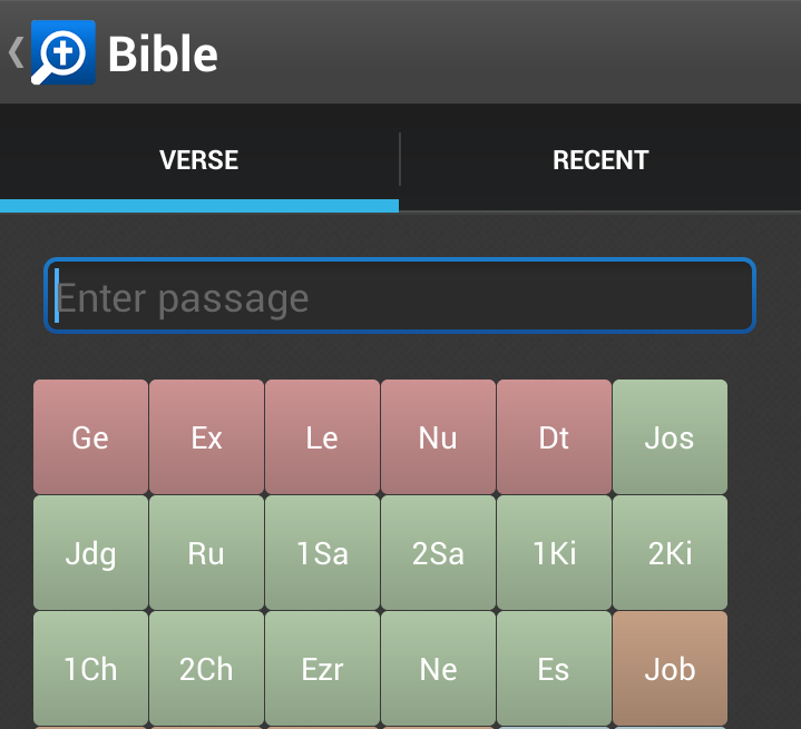
I love that the page number is shown on the bottom
And the verse selector is just delightful:
Info panel in reading view
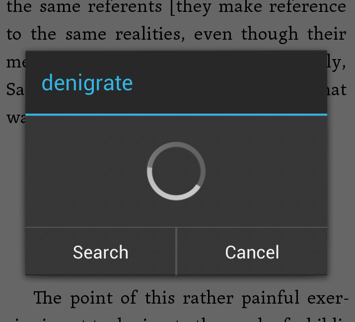
If one long-presses a word in reading view, and chooses info, one will get the info panel. I do not know if this works with everyone else, but unless it is a greek/hebrew word this panel comes up empty. I get the spinning wheel, and then nothing. I would have expected an english definition from either Webster or a bible dictionary. Of course, when the spinning wheel disappears the cancel button is replaced for one that openes a bible word study. Logically a bible word study should provide the desired definition, but alas no, definition comes up empty: (I am guessing this is a bug)
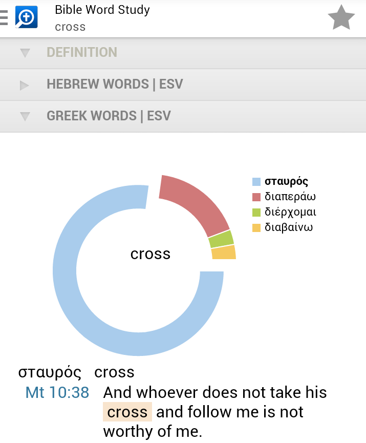
When testing this I came a cross another peculiarity. In order for it to be of value I guess that I need to explain exactly what happened. (1) I opened UBS4 to Philippians 2:8. (2) I long-pressed the seventh word in the verse, which is the second Thanatou. (3) In the contextual meny I pressed "Info" (4) Now here is the strange thing. The heading for the info-box shows Thanatou, but the info is for the following word. This does not regularly happen, but in this specific case it does.
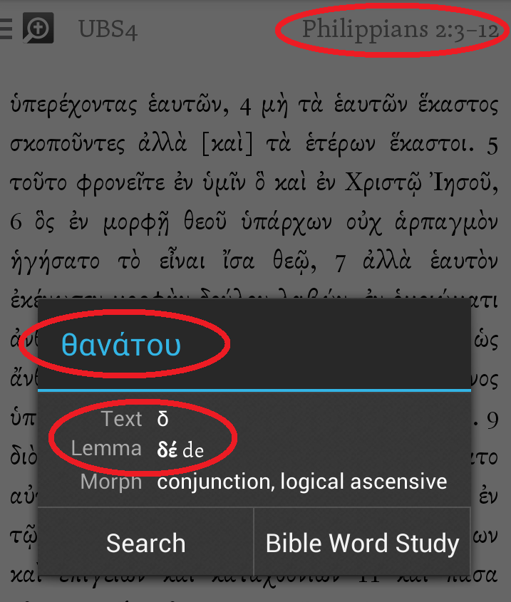
Another peculiarity is that when I press "Bible Word Study" the app seems to look up the surface text first, and then redirect to the lemma. Why not just look up the lemma to begin with?
Selecting long text
Selecting longer pieces of text is easier now that you can scroll with two fingers - that is, as long as the text is able to fit into the window. As far as I can tell there is no way of selecting more text than what fits into one page. Is it possible to allow selection of text across pages?
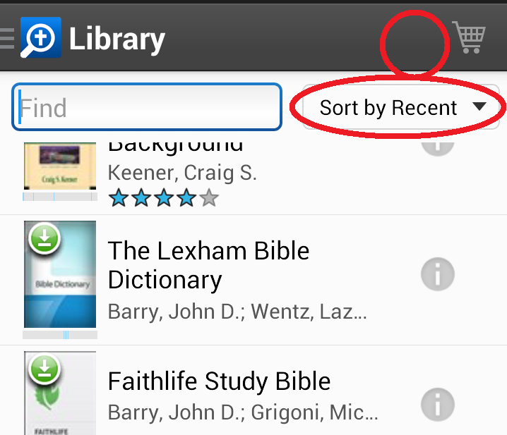
Library navigation
With the old app, if you turned off the internet the app would only show downloaded resources. The new app shows them all regardless of internet connection status. This is probably a good thing, but I miss the ability to hide online resources - or if nothing else, order by download status. The best thing would be having a button to show only downloaded resources.
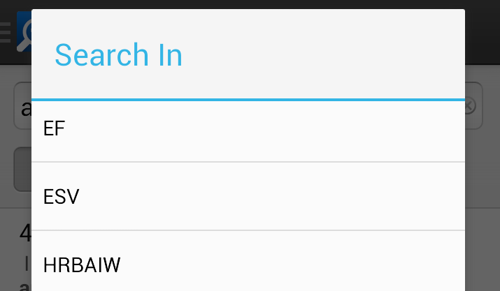
Search
The search dialog allowes a search to be confined to a specific resource, which I believe you need to have downloaded. The drop down list shows a couple of standard options as well as all the downloaded resources. Problem is that it only shows the short title, and it may not be obvious what this short title really means. Could it not be both. Begin with the short title, then a separator followed by the full title. In the example below this would mean: "EF : Exegetical fallacies", "ESV : English Standard Version" and so on.
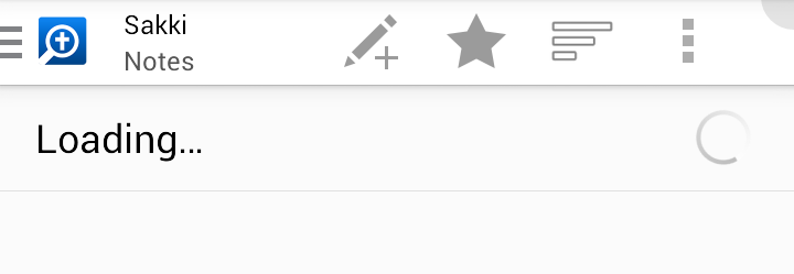
Notes error
It seems to me that some notes documents cannot be opened. If I try to open this one, for example, the wheel spins a while, then the screen goes black for a moment and the app crashes:
I also cannot see highlights in my notes documents (those I know to contain highlights), like you can see in this post: http://community.logos.com/forums/t/76509.aspx
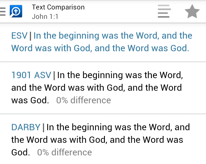
Text comparsion
Text comparsion is great, but I cannot figure out how you choose which versions to compare. Obviously I opened the help file, which directed me to the website. There is no real help text, and I certainly did not want to watch videos on my celluar data connection. In any case there was no straightforward way of doing it:
Panel behaviour
Panel behaviour has been discussed a bit, and there seem to be a few different opinions. It seems to me that this needs to be more straightforward. Here are some thoughts:
- Could there be different colors on the panels, e.g. a gray background on the bottom panel and sepia background on the top panel, so that you can immediately distinguish between them?
- Could one long-press a link to choose in which panel one wants to open a tool or resource.
- Could there be a toolbar button to choose default target: Top panel, bottom panel or auto.
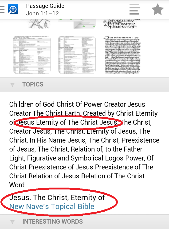
Topics in passage guide
This is a feature I think needs a little more polish, and it took me a moment to figure it out. First there is no clear separator between topics. It gets especially confusing with some topics containing a comma. Then, if you press on a topic, it appears under the list with a link either Naves topical Bible, or some other resource. I guess it is all right, but not quite as I would have expected. Rather I would have expected something like the list "opening up" and the links to resouces appear in the empty space. (You know, like pressing the plus sign in the Faithlife study bible)
Well, that's it I guess
Thank you again for the app - it really is great.


