I was perusing this resource and I noticed that the formatting did not meet the standards for what I think a Logos resource should look like.
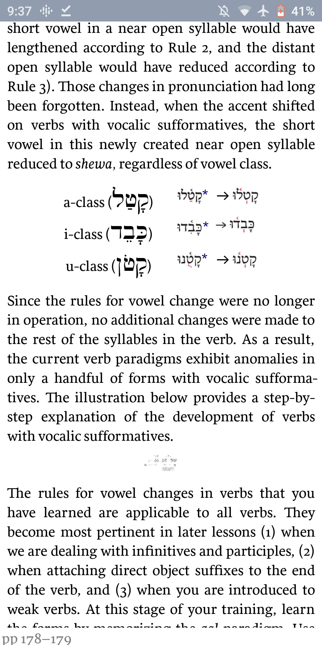
I understand why Logos did what they did - they have no way to make a Hebrew vowel point red while keeping the consonant black (I presume). In Van Pelt's grammar they made everything black, which made it impossible to know what he said was the diagnostic feature. It was only when I glanced at someone's textbook that I realized what I was missing. In this book, they inserted images of the word with the correct coloring. The problem is that these images were of low quality and therefore blurry, and they didn't match the size of the surrounding text. To make matters worse, the image background was sometimes white, sometimes gray, and the table itself sometimes had a seemingly random gray background which made it gray on dark gray on white; a box within a box. In addition, there was one image of table that was impossible to see! (In Android or Windows). See the final two pictures!


Kutz, Karl V., and Rebekah L. Josberger. Learning Biblical Hebrew: Reading for Comprehension: An Introductory Grammar. Bellingham, WA: Lexham Press, 2018.