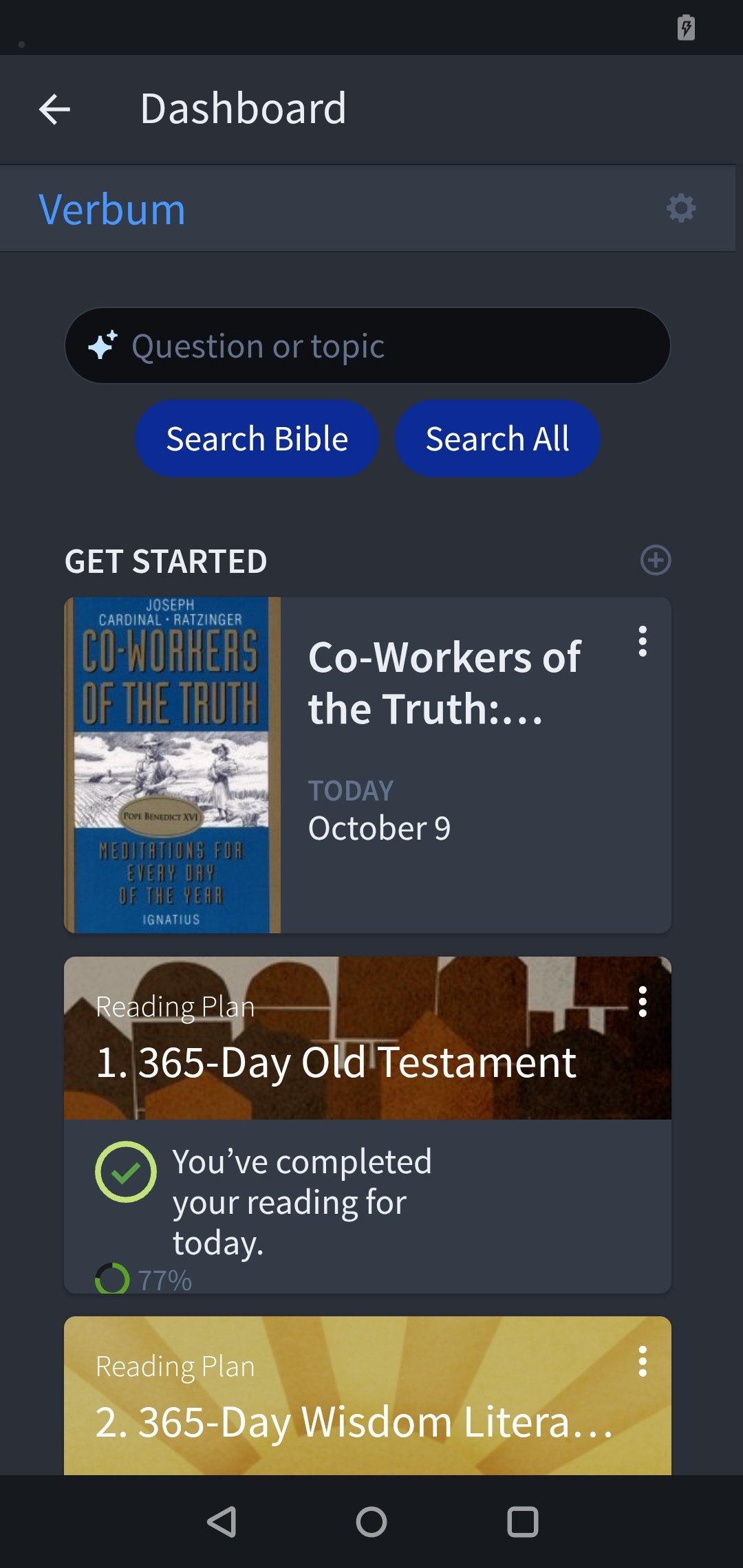
I understand what you're trying to do, but mobile isn't desktop. Cards are much too big in relation to screen size and are very prone to be put in reorder mode erroneously. Reorder mode is not great… glitchy and awkward
There is no option to hide the search, which I never use from dashboard and is just a waste of space for me.
As the redesign does not add functionality with the enormous additional space requirements, I find it wasteful and creates unnecessary (and unwanted) scrolling. The previous version was much more efficient.
Also, the Show Banner option in settings does not appear to do anything.