Feature Request to improve Word by Word

I love using word by word in my studies, but I find two issues:
1. It takes a long time to display all the info.
2. It takes up so much space on my screen that I am always scrolling.
Here would be a solution to both of these issue that I think would be easy to implement.
Here is the current settings we can have for word by word:
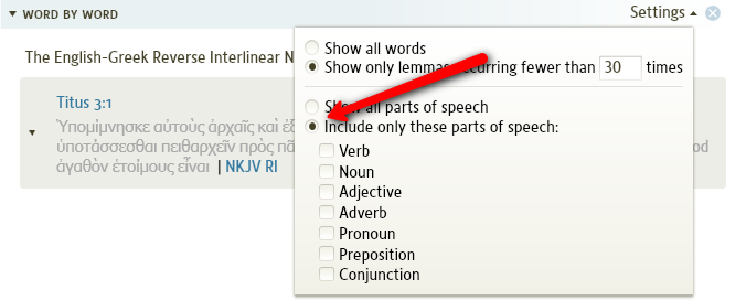
Currently if you select the "include only these parts of speech" option word by word comes up instantly (or close to it), and when you click on a word you get the following (again almost instantly):
With this option there is no scrolling needed - but there is a small problem - If I click on another word it to shows up almost instantly, but the previous word remains with no way of getting rid of it - so each word you click on keeps adding up until you are back to scrolling.
So here is the feature request:
Could we have one more option in the settings drop down for word by word called something like "Display one word at a time"
With his option checked, when you select Word by word it would come up with no words selected. When you click on a word it would show the info for that word, clicking on another word would delete the info for the previous word and replace it with the info for the newly selected word.
This simple feature would increased the "perceived" speed of word by word, and remove need for constant scrolling while doing a study.
Comments
-
This is an interesting suggestions. Our intention was for the Exegetical Guide to be a report, more than an interactive tool. If you just want to examine one word at a time, I would think that the Information tool would be more useful. It offers much of the same information.
Would this meet your need? Or would it if you had more control over what displayed in it?
0 -
Bob Pritchett said:
This is an interesting suggestions. Our intention was for the Exegetical Guide to be a report, more than an interactive tool. If you just want to examine one word at a time, I would think that the Information tool would be more useful. It offers much of the same information.
Would this meet your need? Or would it if you had more control over what displayed in it?
I have the EG set to not automatically look up any words. It only looks them up when I click on them. I will probably always use this over the information window but I'm not really sure why. Perhaps if the information had more control over it I would use it, but I doubt it. There is just something about the exegetical guide that I like.
0 -
Philip Spitzer said:
I have the EG set to not automatically look up any words. It only looks them up when I click on them.
Great tip, Philip! Thanks.
Dr. Kevin Purcell, Director of Missions
Brushy Mountain Baptist Association0 -
Kevin A. Purcell said:
Great tip, Philip! Thanks.
For those who may not know how to do this, set up the Word for Word like this.
0 -
Great tip philip!!
Robert Pavich
For help go to the Wiki: http://wiki.logos.com/Table_of_Contents__
0 -
Philip - That is the way I currently have mine set up as you can see from the picture I displayed above.
But if I end up clicking on several words then it starts to add up and I'm back to scrolling and trying to keep track of things.
What I'm asking for is the ability to only show the information for one word at a time (once you click on the second word the information for the first is deleted and replaced for the information for the second).
[quote]This is an interesting suggestions. Our intention was for the Exegetical Guide to be a report, more than an interactive tool. If you just want to examine one word at a time, I would think that the Information tool would be more useful. It offers much of the same information.
Would this meet your need? Or would it if you had more control over what displayed in it?
I use to use the information tool in V3, but the way it is implemented in V4 I tend to stay away from it. Currently it is slow and gives inconsistent and unneeded information (even with prioritizing appropriate resources)
I just thought this might be an easy way to help people with smaller screens (the growing ultra-portable market), and ones with slower systems.
Also Word by word is already somewhat "interactive" as it is implemented currently, this would just be adding one more level of interactivity.
0 -
Greg Gray said:
Philip - That is the way I currently have mine set up as you can see from the picture I displayed above.
sorry about that...I'm a victim of message skimming :-) I even skimmed over a picture, how bad is that!
Greg Gray said:What I'm asking for is the ability to only show the information for one word at a time (once you click on the second word the information for the first is deleted and replaced for the information for the second).
I see what your saying. I remember a discussion about this during beta. My preference would similar to yours but would include the following as well 1)return to top link on each word 2)One section under the verse that updates to the currently selected word, and then under that section every word that has been clicked on. 3) I would keep the passage together rather than having each verse in its own block
0 -
Bob Pritchett said:
If you just want to examine one word at a time, I would think that the Information tool would be more useful. It offers much of the same information.
for me, this is one of the ways that Logos is very slow. If I have this tool open it lags more. closing it helps. until it can keep up with the rest of the program, I cannot use it regularly.
Dr. Kevin Purcell, Director of Missions
Brushy Mountain Baptist Association0 -
Kevin A. Purcell said:
for me, this is one of the ways that Logos is very slow. If I have this tool open it lags more. closing it helps. until it can keep up with the rest of the program, I cannot use it regularly.
That's probably the majority of the reason I don't use it. It feels like I'm spending most of my time waiting for it to populate information.
0 -
This is a very useful tip. I have been wanting a way to collapse the information in word by word.
The problem now is that the text is grey on a grey background, and when I hover over a word it is highlighted in a greyish blue. It is nice to have less scrolling to do, but it does make it more difficult to read.
Has anyone found a workaround?
0 -
After using this feature from Philip I have to agree...I much prefer the EG over the INFO window...
I just like it
If there were no scrolling or a "shift click" opened up word after word as the alternate way....then that would be great.
Robert Pavich
For help go to the Wiki: http://wiki.logos.com/Table_of_Contents__
0 -
Bob Pritchett said:
Would this meet your need?
Some contrast in the display. Grey on grey is practically useless as it is almost totally unreadable.
I agree with the other poster's comments on the Information window. Even with the better control settings in 4.0b, this window is still far too slow for effective use.
0 -
Jack Caviness said:
Some contrast in the display. Grey on grey is practically useless as it is almost totally unreadable.
Have you tried the adjustment page in the wiki? It definately improved contrast for me.
Orthodox Bishop Alfeyev: "To be a theologian means to have experience of a personal encounter with God through prayer and worship."; Orthodox proverb: "We know where the Church is, we do not know where it is not."
0 -
MJ. Smith said:Jack Caviness said:
Some contrast in the display. Grey on grey is practically useless as it is almost totally unreadable.
Have you tried the adjustment page in the wiki? It definately improved contrast for me.
Thanks for the info; however, that does not work on a Mac. Dimming the display did help some, but grey on grey is still an atrocious display choice.
0