BUG (SERIOUS) - malformed context menu lookup action

MJ. Smith
MJ. Smith MVP Posts: 53,116

To reproduce - although this is not limited to any example - NRSV to Gen 11:31 - select Context Menu - note the Lookup section which has an unusual layout, unlimited number of entries, and omits the actions that follow look up. I am not happy that I've had to report this a second time. It is the sort of error that should be fixed ASAP because it interferes with a basic program function.
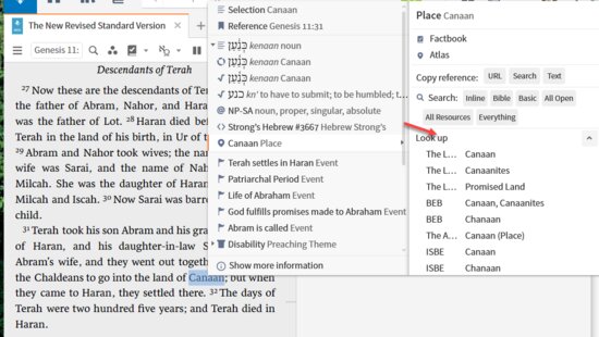
Err 3

Orthodox Bishop Alfeyev: "To be a theologian means to have experience of a personal encounter with God through prayer and worship."; Orthodox proverb: "We know where the Church is, we do not know where it is not."

Comments

  • Graham Criddle
    Graham Criddle MVP Posts: 32,469

    I'm trying to understand the problem more fully.

    I see that the Lookup entry is formatted differently but I'm wondering what should appear after it in this case.

    The example below just focuses on the word selected and shows a range of functions below the Lookup command. Which of this should be available / make sense for a biblical place / person / sense etc?

    image

  • MJ. Smith
    MJ. Smith MVP Posts: 53,116

    Power lookup and Wikipedia are the most common items missing - happens with places, things, and a few others that I've hit.

    Orthodox Bishop Alfeyev: "To be a theologian means to have experience of a personal encounter with God through prayer and worship."; Orthodox proverb: "We know where the Church is, we do not know where it is not."

  • Andrew Batishko
    Andrew Batishko Member, Community Manager, Logos Employee Posts: 5,365

    This is operating in the way I would expect.

    The list of resources for references like these do not use a keylink lookup to find the associated articles as is done with other references. Given the mechanism used, multiple articles per resource are more frequent here. This makes it more important to list the article titles along with the resource. It is arguably a bug that the list does not cap at 5 resources.

    There is no Power Lookup option, because Power Lookup doesn't support Biblical Places.

    I'm not sure what other actions you are expecting to see.

    Andrew Batishko | Logos software developer

  • Andrew Batishko
    Andrew Batishko Member, Community Manager, Logos Employee Posts: 5,365

    Power lookup and Wikipedia are the most common items missing - happens with places, things, and a few others that I've hit.

    The Wikipedia tool doesn't support navigating to a place or thing, or really anything except text, which is why it only shows up on the text-based items like "Selection".

    Andrew Batishko | Logos software developer

  • Simon’s Brother
    Simon’s Brother Member Posts: 6,816 ✭✭✭

    So you are saying

    1) FL can’t enhance the code to reach the text layer so Power Lookup etc can be supported?

    or; 

    2) FL didn’t consider users would have expectations that these functions would be available regardless of what’s happening under the hood, that all users see is text tagged as being a ‘Biblical Place’ or whatever the case maybe and they would naturally expect a Power Lookup could be run on that text?

    Either way are you saying the program is behaving as designed and users will just have to change their expectations because there is no case to open? Or are you going to open a case to go back and look if the programmers can meet user expectations on what they see as basic functionality?

    Power lookup and Wikipedia are the most common items missing - happens with places, things, and a few others that I've hit.

    The Wikipedia tool doesn't support navigating to a place or thing, or really anything except text, which is why it only shows up on the text-based items like "Selection".


  • Andrew Batishko
    Andrew Batishko Member, Community Manager, Logos Employee Posts: 5,365

    I'm giving MJ an opportunity to provide additional information about what she is seeing as a "SERIOUS" bug.

    It is correct that the application is currently working as designed. This never means that it is operating in an ideal fashion.

    It's interesting to me that the expectation is that all things would work with Power Lookup. Depending on how you count, there are probably more things in the context menu that don't work with that tool than do. There are many places in the application where different functionality is available to different types of data.

    Having the Power Lookup tool support People/Places/Things would be a new feature. Typically we recommend that requests for these be submitted to the feedback site. Creation of a case is typically used for bug reports.

    There are many places in the application where user expectations don't match the way the application behaves. For what I hope are obvious reasons, we try to minimize these. There are many reasons for these differences. Some differences are resolved by a bug fix. Some differences are resolved by implementing a new feature. Some differences are resolved with documentation. Some differences remain in the application over an indefinitely long period of time despite everyone's desire for an application that perfectly meets all expectations.

    Andrew Batishko | Logos software developer

  • Dave Hooton
    Dave Hooton MVP Posts: 35,677

    It is correct that the application is currently working as designed. This never means that it is operating in an ideal fashion.

    Babylon (in "province of Babylon", Dan 2:48) works as I expect when Selection is chosen  i.e. 5 dictionaries on "Babylon" including HBDRU (my #1).

    When Place Babylonia is chosen  there are multiple dictionaries. But HBDRU (my #1) acts on "Accad" when it should act on "Babylon" which discusses Babylonia.This would be consistent with Place Babylon (in "men of Babylon", Dan 2:48) which lists Babylon, Accad, Babel and Cities(!) against HBDRU. Other dictionaries act on Babylonia.

    The "Accad" article mentions Old Babylonia and Ancient Babylon, so it seems an unlikely association with the Babylon, Babylonia of Daniel (as is Babel and Cities).  "Accad" similarly carries the confusion of meaning a city or the associated province/territory.

    Dave
    ===

    Windows 11 & Android 13

  • Simon’s Brother
    Simon’s Brother Member Posts: 6,816 ✭✭✭

    Andrew I am simply asking my own questions around the issue MJ raised. They are not unfair questions. For to me as a user, inconsistent interface behaviour is a serious issue whether you call it a bug, design issue or anything else. Users don’t want to necessarily know all the ins and outs of the technical details under the hood and want software where they are not expected to know that stuff in order to understand why things they expect to see are not there.  Therefore hiding behind this is a knee feature when it is really a failure of design (as you are not conceding as I understand that it is not possible) is a response that says as a design team you don’t want to admit you don’t understand your users expectations of wanting a simple, clean an consistent interface with minimal steps. It’s up to FL how they respond when users call out they are missing their expectations but saying sorry that’s a new feature request doesn’t cut it because we know FL operates on their own agenda when it comes to new feature, and those new features often are aimed at a smaller segment of the user community while fixing up what you have missed in existing basic functions in the interface is ignored. Another reason your suggestion is this a new feature does not cut it because new features are what FL has clearly associated with something users pay for, and this is not something you could sell to users as something they would pay for because once again we go back to this is inconsistent interface behaviour because the design team focus too much on the technical internal view instead of the user experience.

    Thanks for your time.


    I'm giving MJ an opportunity to provide additional information about what she is seeing as a "SERIOUS" bug.

    It is correct that the application is currently working as designed. This never means that it is operating in an ideal fashion.

    It's interesting to me that the expectation is that all things would work with Power Lookup. Depending on how you count, there are probably more things in the context menu that don't work with that tool than do. There are many places in the application where different functionality is available to different types of data.

    Having the Power Lookup tool support People/Places/Things would be a new feature. Typically we recommend that requests for these be submitted to the feedback site. Creation of a case is typically used for bug reports.

    There are many places in the application where user expectations don't match the way the application behaves. For what I hope are obvious reasons, we try to minimize these. There are many reasons for these differences. Some differences are resolved by a bug fix. Some differences are resolved by implementing a new feature. Some differences are resolved with documentation. Some differences remain in the application over an indefinitely long period of time despite everyone's desire for an application that perfectly meets all expectations.

  • MJ. Smith
    MJ. Smith MVP Posts: 53,116

    My expectations are built based on recognizing the pattern of the 80+ tab types that I have observed in the Context menu across my library of 19,000 active Bible related resource. Other inconsistencies I have observed:

    • I am unclear on the function of "Link" vs. "Reference" - this is an ask in the forums issue
    • I need to check details more closely to see if the use of the "{Section}" extension is applied consistently in the Copy reference: Search option.- this is already an open conversation with Bradley
    • There is a fault in the Look up function on 3 of the Andersen-Forbes AFAT coding tabs - this is a file a bug report issue
    • Longacre genre is odd as it is one of two titles that has two meanings - one as a datatype, the other as a label - this is a training issue
    • Reference is the other title with two meanings - one as the reference for the selected text, the other for references in the selected texts (i.e. links). - this is a training issue
    • While labels are handled consistently, I believe that labels should also have a link to the glossary information on it's values; this is on Feedbear.
    • The semantic data which was in the context menu prior to its redesign has not been reinstated leading many forum posts that abuse morphology; this is a Feedbear issue.

    In this context, the context menu is by design a compact way to access attributes of the texts in order to perform a variety of actions --> go to major sources of information, run searches, add to documents, add community tags, report errors ... the emphasis of the design is that it the context is a pass-through not a source of information. It has the following characteristics:

    • on the tab side, entries are single line with groups that expand/contract so that the total list rarely exceeds two pages in length visually.
    • on the action side, entries are compact rarely exceeding 2 lines; the total list rarely exceeds one and a half pages in length visually
    • the use of icons on the tab side and spacing and font size on the action side, make it very easy to identify what you want at a glance despite the fact that the contents on the action side are highly variable.

    Why I considered this a bug:

    • it starts to turn the Context Menu into a source of data rather than a pass-through
    • it expands into topics I would expect to go to Factbook for ... here they are simply an annoyance that prevents me from finding the relevant information about the base tab I selected:
      Err 1
    • I have 164 resource of type:encyclopedia. If I want to see them all I will go to Factbook or run a search. You could add a search option to search all dictionaries but I don't want to scroll through 10+ pages of entries.
    • In order to see if any of the later options appear on the action side, I can no longer get a quick visual look as I have been led to expect  from the 80 or so other items in the tab list. No, I have to scroll through literally hundreds of entries to see if there are or are not additional actions available.

    In short, I considered it a bug because I couldn't imagine your design team having made such a horrendous error -- so out of touch with the basic design of the Context Menu and so out of touch with its behavior in large libraries. I assumed it was a coding error in keeping a count or invoking the max count reached routine.

    There are many places in the application where user expectations don't match the way the application behaves.

    In this case my expectations were based on how 97% of the Context Menu worked ... by observation of how it actually worked, errors and missing entries and what works very well. And I think if you test common cases against a large library, you too will consider it a bug - you may choose to call it a bug in design or a bug in implementation. I don't care. But I do care that you understand you have screwed up 3 of the most used tabs for those of us not using Logos primarily for original language work.

    Orthodox Bishop Alfeyev: "To be a theologian means to have experience of a personal encounter with God through prayer and worship."; Orthodox proverb: "We know where the Church is, we do not know where it is not."

  • MJ. Smith
    MJ. Smith MVP Posts: 53,116

    It is arguably a bug that the list does not cap at 5 resources.

    This is PRECISELY what I was reporting as a bug ... and had reported before.

    It's interesting to me that the expectation is that all things would work with Power Lookup.

    Interesting to me too as I never intended to say that ... I gave examples of common things I expect to see after the Look up ... I expect to see them because their presence or absence indicate what is possible pursuing this particular piece of data.

    Orthodox Bishop Alfeyev: "To be a theologian means to have experience of a personal encounter with God through prayer and worship."; Orthodox proverb: "We know where the Church is, we do not know where it is not."

  • Andrew Batishko
    Andrew Batishko Member, Community Manager, Logos Employee Posts: 5,365

    This is PRECISELY what I was reporting as a bug ... and had reported before.

    [Y] I'm on board with this as a bug. I'll report it as such on Monday.

    Interesting to me too as I never intended to say that

    I heard that from Disciple. It wasn't clear to me if that was what you were trying to say. Thanks for clarifying.

    Andrew Batishko | Logos software developer

  • Andrew Batishko
    Andrew Batishko Member, Community Manager, Logos Employee Posts: 5,365

    For to me as a user, inconsistent interface behaviour is a serious issue whether you call it a bug, design issue or anything else.

    I agree, with the caveat that not all examples of inconsistent interface behavior are of equal severity. I would expect some amount of disagreement between users on the level of significance.

    Therefore hiding behind this is a knee feature when it is really a failure of design (as you are not conceding as I understand that it is not possible) is a response that says as a design team you don’t want to admit you don’t understand your users expectations of wanting a simple, clean an consistent interface with minimal steps.

    I have no problems with admitting to design failures. It was one of the things in my list of sources of differences between application behavior and user expectation, until I took out the list because it was growing long and didn't seem worth iterating. I also stated "This never means that it is operating in an ideal fashion." (which in retrospect is a slightly confusing way to say "Even if the application is working as designed, it's no guarantee that the design is ideal."

    It’s up to FL how they respond when users call out they are missing their expectations but saying sorry that’s a new feature request doesn’t cut it

    I disagree with what seems to be your assumption that we are rejecting the idea of implementing the Power Lookup feature in question. Cases are written for bugs, which are unintended flaws in the application. Cases may also be written up for new features that are in development and being tested during their first (and occasionally subsequent) beta cycle. The feedback site is intended to track suggestions for new functionality. Directing someone to the feedback site is in no way an indication of the likelihood that an issue will be addressed. It's only an indication of the kind of work required to address it.

    Another reason your suggestion is this a new feature does not cut it because new features are what FL has clearly associated with something users pay for

    I also disagree with this statement. I recognize that I'm not likely to change your mind here, but for the sake of others reading this, I think you will find a wealth of new features available for free just in Logos 9 alone (to say nothing of the new features added during the life cycle of version 8) which require absolutely no purchase from users. And, in fact, feature improvements to existing functionality (as opposed to brand new features that stand on their own) are usually (though not always) free as opposed to paid improvements. The request made for Power Lookup sounds to me like something that could be considered for a free feature, but would need to be prioritized against other features and bug fixes. A part of the prioritization process is seeing support and feedback from customers on the feedback site.

    Andrew Batishko | Logos software developer

  • MJ. Smith
    MJ. Smith MVP Posts: 53,116

    the idea of implementing the Power Lookup feature in question.

    Just for the record, my original report made no mention of the Power Lookup -- nor did my original report. I did, in response to a question from Graham, give it as an example of what I expect to see after the Lookup function ... I mentioned Power Lookup because it is an element that comes after but in the same logical unit as Lookup ... Wikipedia and Report typos as well as occasional add to list, run supplemental guides also came to mind. I'm shaking my head trying to figure out how a report of over 200 entries in Lookup screwing up the usability of the Context Menu morphed into a request to add the Power Lookup ...

    Orthodox Bishop Alfeyev: "To be a theologian means to have experience of a personal encounter with God through prayer and worship."; Orthodox proverb: "We know where the Church is, we do not know where it is not."

  • Simon’s Brother
    Simon’s Brother Member Posts: 6,816 ✭✭✭

    Thank you Andrew for taking the time to respond. I do appreciate that. On sone points we are going to have to continue to disagree As FL’s actions speak louder than their intent. FL has a long way to go to get back to being the company I first dealt with many years ago and we could spend the next week debating your perception of things as an employee of the company v my perception as an individual customer. But that would bore everyone else to tears and take your focus of more important things. So I’ll leave you with this thought. If all if the customers went away you could all develop the software you as you all think it should function.  With all the customers gone there would be no cash flow for the business. So who would pay your wages or the company’s bills? But you know what we only challenge you to do better, to listen more deeply to your customer, to fix the less glamorous aspects of the software because we believe in the core product you offer, and we believe you as employees of the company are up to the challenge. 

    For to me as a user, inconsistent interface behaviour is a serious issue whether you call it a bug, design issue or anything else.

    I agree, with the caveat that not all examples of inconsistent interface behavior are of equal severity. I would expect some amount of disagreement between users on the level of significance.

    Therefore hiding behind this is a knee feature when it is really a failure of design (as you are not conceding as I understand that it is not possible) is a response that says as a design team you don’t want to admit you don’t understand your users expectations of wanting a simple, clean an consistent interface with minimal steps.

    I have no problems with admitting to design failures. It was one of the things in my list of sources of differences between application behavior and user expectation, until I took out the list because it was growing long and didn't seem worth iterating. I also stated "This never means that it is operating in an ideal fashion." (which in retrospect is a slightly confusing way to say "Even if the application is working as designed, it's no guarantee that the design is ideal."

    It’s up to FL how they respond when users call out they are missing their expectations but saying sorry that’s a new feature request doesn’t cut it

    I disagree with what seems to be your assumption that we are rejecting the idea of implementing the Power Lookup feature in question. Cases are written for bugs, which are unintended flaws in the application. Cases may also be written up for new features that are in development and being tested during their first (and occasionally subsequent) beta cycle. The feedback site is intended to track suggestions for new functionality. Directing someone to the feedback site is in no way an indication of the likelihood that an issue will be addressed. It's only an indication of the kind of work required to address it.

    Another reason your suggestion is this a new feature does not cut it because new features are what FL has clearly associated with something users pay for

    I also disagree with this statement. I recognize that I'm not likely to change your mind here, but for the sake of others reading this, I think you will find a wealth of new features available for free just in Logos 9 alone (to say nothing of the new features added during the life cycle of version 8) which require absolutely no purchase from users. And, in fact, feature improvements to existing functionality (as opposed to brand new features that stand on their own) are usually (though not always) free as opposed to paid improvements. The request made for Power Lookup sounds to me like something that could be considered for a free feature, but would need to be prioritized against other features and bug fixes. A part of the prioritization process is seeing support and feedback from customers on the feedback site.

  • Andrew Batishko
    Andrew Batishko Member, Community Manager, Logos Employee Posts: 5,365

    I'll report it as such on Monday.

    Oops, I meant Friday. I've created a case to limit the list of links to articles from the first 5 resources.

    Andrew Batishko | Logos software developer

  • Dave Hooton
    Dave Hooton MVP Posts: 35,677

    I've created a case to limit the list of links to articles from the first 5 resources.

    That seems to be fixed in Beta 25.

    Dave
    ===

    Windows 11 & Android 13