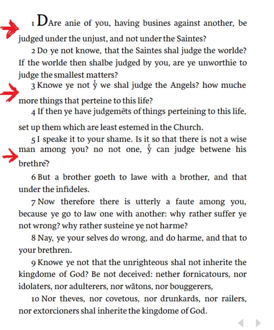
Geneva Bible & odd line spacing under printer abbreviated words
The screenshot shows the line spacing error under words such as: "yͭ" and "judgemẽts".
This also shows up in the first verse; perhaps from the formatting of the "A" in the first word ("DAre").
It doesn't matter if it is single column, without columns, or that the line spacing is set to "tight", "normal" or "loose", justified or not.
It shows up with them all.
Comments
-
Anybody else with this issue?
I tried searching through the forums and couldn't find anything specific like this.
0 -
A Reformed said:
Anybody else with this issue?
I tried searching through the forums and couldn't find anything specific like this.
I think issues like this have been discussed in the forums in the past. It obviously is an issue with how the font you use in displaying the Geneva bible has implemented that rare character, so FL probably can't do much.
The best way is to try other fonts that feel okay for you from the line spacing as well as the overall look. Using Default Sans Serif looks much better to me, but if you like a font with serifs, Times New Roman may be your friend. The good thing is, you can have the settings open in a second tab and play around with the fonts until it's okay for you.
Have joy in the Lord!
0 -
Thanks for the response, I hadn't thought of that before.
As I appreciate the default font of Logos, is there no way to customize the font of any individual Bible or book?
0 -
Thanks for the response, I hadn't thought of that before.
As I appreciate the default font of Logos, is there no way to customize the font of any individual Bible or book?
0 -
A Reformed said:
Thanks for the response, I hadn't thought of that before.
As I appreciate the default font of Logos, is there no way to customize the font of any individual Bible or book?
Not unless you build it as a Personal Book.
Have joy in the Lord!
0