4.0.3 First impressions - Issues - Hopes..

LOVE LOVE LOVE it.. except a couple of minor niggles..
Nexus 7(2013)
Android 4.3
The New Location scroll bar is nice, but PLEASE can we have option in settings to hide it, personally find it obtrusive and annoying, plus it affects the text under it, for me with the normal verse navigation - looks good but will never use it.,
When Adding Notes, trying to move the selection pointer at the left edge of screen often the menu drags out instead, can you consider adding a flag to say "selecting" and stop menu opening if we are selecting
Now we have all notes documents on-board, can you please consider adding the next logical step, allowing us to change the document the annotation belongs to in edit mode, this will prove incredibly useful in the future.
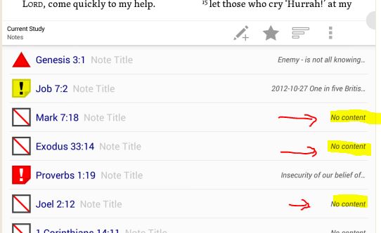
Finally, please can I beg/bribe you to add a option in the document view to hide pure highlighting, ie notes with no annotation text and no annotation title, this would again prove helpful, so we could only toggle it to show "real" notes with actual content
[EDIT] Oh yes sometimes the logos icon is grey and sometimes blue, any significance, doesn't seen to matter if online/offline
Great first Beta, well done team
Never Deprive Anyone of Hope.. It Might Be ALL They Have
Comments
-
DominicM said:
The New Location scroll bar is nice, but PLEASE can we have option in settings to hide it, personally find it obtrusive and annoying, plus it affects the text under it, for me with the normal verse navigation - looks good but will never use it.,
You should be able to hide the scroll bar by just tapping the screen. Is this not working for you?
DominicM said:Now we have all notes documents on-board, can you please consider adding the next logical step, allowing us to change the document the annotation belongs to in edit mode, this will prove incredibly useful in the future.
I'll look into this. iOS doesn't allow changing the document for an existing note either, so there may be something blocking that capability.
DominicM said:[EDIT] Oh yes sometimes the logos icon is grey and sometimes blue, any significance, doesn't seen to matter if online/offline
We set the icon to greyscale when the action bar and location seek bar are hidden to minimize distractions to reading. [:)]
0 -
Thanks
Drew Hannay said:Is this not working for you?
Yes but was hoping for more "permanent" option
Drew Hannay said:there may be something blocking that capability
Hopefully you can "simply" just use same drop down and code behind from adding a new note.. but will leave it for you to investigate
Never Deprive Anyone of Hope.. It Might Be ALL They Have
0 -
So far love the update. Great Job to the Logos Android Team! One request would be adding the "paper" background to the display options. Normal and low light serve their purposes but the "paper" reading background like on the Desktop version would be awesome.
Logos 10 - OpenSuse Tumbleweed, Windows 11, Android 16 & Android 14
0 -
Frank Sauer said:
So far love the update. Great Job to the Logos Android Team! One request would be adding the "paper" background to the display options. Normal and low light serve their purposes but the "paper" reading background like on the Desktop version would be awesome.
Thanks!
"Paper" (or "Sepia" as we call it) is something a number of people have asked for, but I'm not sure it's on our radar at the moment. I'd suggest creating a suggestion/voting at http://logosmobile.uservoice.com/forums/190765-logos-mobile-apps/filters/top.
0 -
David Schwegler (Logos) said:
"Paper" (or "Sepia" as we call it) is something a number of people have asked for, but I'm not sure it's on our radar at the moment. I'd suggest creating a suggestion/voting at http://logosmobile.uservoice.com/forums/190765-logos-mobile-apps/filters/top.
I think "Paper" on Logos Desktop and "Sepia" in iOS may be slightly different colors, but the point of David's post still stands. Uservoice is your best avenue for this request right now.
0 -
Thanks David and Drew!
User voice suggestion created:
Logos 10 - OpenSuse Tumbleweed, Windows 11, Android 16 & Android 14
0 -
Drew Hannay said:DominicM said:
The New Location scroll bar is nice, but PLEASE can we have option in settings to hide it, personally find it obtrusive and annoying, plus it affects the text under it, for me with the normal verse navigation - looks good but will never use it.,
You should be able to hide the scroll bar by just tapping the screen. Is this not working for you?
I'd also like an option to hide only the scroll bar as tapping has the same effect as a finger down stroke and also removes the 'header' bar with its menus.
Dave
===Windows 11 & Android 13
0 -
No I'm not keen on the scrollbar either - it is far too coarse a control to be of much use on a mobile screen and it gets in the way for me.
0 -
Dave Hooton said:
I'd also like an option to hide only the scroll bar as tapping has the same effect as a finger down stroke and also removes the 'header' bar with its menus.
The next beta will include an option to keep the reading pane action bars always visible, so tapping the screen will only show/hide the scroll bar. [:)] We're hoping this will be a good option that will help both people who use our apps primarily for reading and those who use it primarily for studying.
0 -
Drew Hannay said:
The next beta will include an option to keep the reading pane action bars always visible, so tapping the screen will only show/hide the scroll bar.
That could work!
Dave
===Windows 11 & Android 13
0 -
Drew Hannay said:
The next beta will include an option to keep the reading pane action bars always visible,
In 4.0.5 both bars show when tapping or stroking, leading one to think nothing has changed. Then I check for the Setting and find:-
Reading Pane Action Bar
"Hide reading pane action bars with a tap"
- singular Bar then plural bars
- setting is OFF (unchecked)
Turning it ON displays the text "Always show the reading pane action bars" but they are not shown in the reading pane until it is tapped, and subsequent tapping alternately hides/shows the bottom bar!
The explanation in the Settings is misleading and should reflect what happens:-
- "Show/Hide reading pane action bars with a tap" when OFF
- "Show action bars - navigation slider can be hidden with a tap" when ON
Default should be OFF i.e. a more complete explanation.
Dave
===Windows 11 & Android 13
0 -
Dave Hooton said:
In 4.0.5 both bars show when tapping or stroking, leading one to think nothing has changed.
Yes, we want to keep that behavior as the default.
Dave Hooton said:Turning it ON displays the text "Always show the reading pane action bars" but they are not shown in the reading pane until it is tapped, and subsequent tapping alternately hides/shows the bottom bar!
That sounds like a bug. They should be shown immediately after changing the setting.
Dave Hooton said:The explanation in the Settings is misleading and should reflect what happens:-
- "Show/Hide reading pane action bars with a tap" when OFF
- "Show action bars - navigation slider can be hidden with a tap" when ON
This is good feedback. I'm the one that came up with that text and I wasn't completely happy with it. I like your suggestion for the OFF state, but your ON text might be a little long. The problem is that this text will be displayed on low resolution phones, so we don't want it to take up too much room.
0 -
Drew Hannay said:
your ON text might be a little long.
How about "Show action bars (tap to hide navigation slider)"?
Dave
===Windows 11 & Android 13
0