I just noticed the version river function seems to be missing in L6. I never used it much in L5 but was curious to see if it has, in fact, been purposely removed?
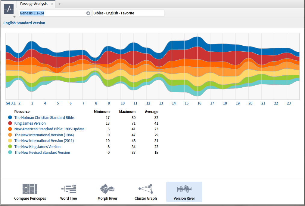
It's still there. It's one of the options in the Passage Analysis tool:
It could disappear forever and i would never care or even notice.
Merry Christmas everyone!
Aah, there it is. Thanks Todd.
Morph River, Cluster Graph, and Version River are all, IMO, unintuitive and of questionable value.
The Rivers attempt to take discrete data and display it in an analog fashion - which is confusing. The only data on the graphics that have any significance at all is at the vertical line(s) that signify the verses. The meandering rivers between these lines are subjective and meaningless.
The Cluster Graph is ... well ... cute but virtually pointless unless word count comparisons between various English versions are high on one's exegetical or homiletical to-do list.
I suppose they could have some value if one wanted to wow an audience with colorful charts and dancing orbs. Nevertheless, if I have misinterpreted these tools and someone is getting genuine value out of them, then, my apologies and I applaud you.
Sorry if this sounds too snarky but I question their inclusion in Logos ... seems like unnecessary bloat.
I agree with JRS. These features were not done as a response to user requests/need, they were done as cool techie features because the developers thought it would be fun. This was in the days when what went into the software was mostly driven by techie geeks. They've gotten better about listening to what users actually want in recent years. And Bob Pritchett, who was pretty into the geeky whiz-bang type features, while he's still very involved, has less of a say these days on decisions about what features go in.
I'm sure they can tell from the automatically collected user feedback how many people are actually using these features, as opposed to just trying them out once to see what they are. I doubt that will make them decide to remove the features for a future version, as long as they are still functioning fine. If they were to become a maintenance nightmare under a new internal architecture, I'm guessing Faithlife might decide to ditch them if nobody is using them anyway.
Methinks some people need a wee bit of education in unstructured text data mining e.g. textual visualizations. I suspect that because of our different uses of Logos we all have features in the product that we never use - not because they are not useful but simply because they aren't the tools needed for our tasks. If Noet is to expand into manuscript/corpus processing for teaching purposes, I would expect this feature to be available more broadly. Restricting it to Bibles limits its usefulness.
attempt to take discrete data and display it in an analog fashion
Do you mean to say, "..attempt to take discrete data and display it in a continuous fashion..."? 'Analog' is neither an antonym, nor even complementary, of 'discrete'.
?
The Version River is so non-intuitive, I don't even know (for sure) its purpose. Discrete data is usually count data. Is something being counted? If so, I completely agree with what I think you meant to say; that is, displaying count data as continuous data is confusing at best. It's like taking the mean of a bunch of nominal data. You get a result, but it is pretty much worthless.
If you really meant 'analog', I'm not smart enough to follow.
So now is not the time to suggest topic river? [;)]
Seriously the comparison river is a visualization of the same data you see in the text comparison tool as a % difference.
The visualization of % difference isn't the problem with it. It's that it's turned into a "flowing" thing with interpolated points in between the verses, which are meaningless. It is discreet data, not continuous data, so showing it as if it's continuous is kind of weird. A bar graph would have made more sense.
I almost added the info on why the display is continuous rather than discreet and decided it was too technical to be useful. Because of the various ways of allowing for additions and deletions the data for unstructured text analysis does not really fall into the discreet/continuous dichotomy. The more sophisticated tools usually use some sort of a rolling calculation.
There is the same problem here as in the tag clouds and wordles ... a group of users wish to see precise values when what is important is relative position and trend. That is precisely the problem that these visualizations were designed to counteract.
Seriously the comparison river is a visualization of the same data you see in the text comparison tool as a % difference. The visualization of % difference isn't the problem with it. It's that it's turned into a "flowing" thing with interpolated points in between the verses, which are meaningless. It is discreet data, not continuous data, so showing it as if it's continuous is kind of weird. A bar graph would have made more sense.
Exactly.
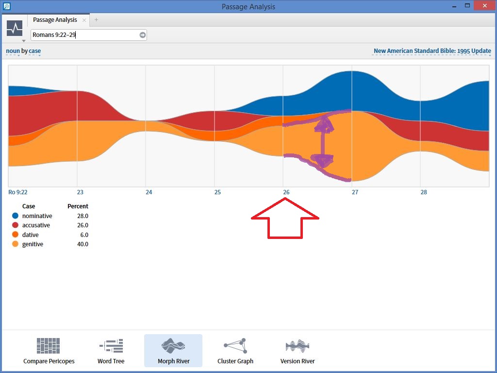
The HELP file for the Morph Graph, for example, states, "The “river” running from left to right, divided by passage units, displays the selected grammatical attributes by color and in a size that reflects the number of times they are used in the passage." It is discrete, a word count comparison, if you will. IOW, the graph only has meaning at the vertical lines (red arrow, below). The meandering in between the vertical lines is meaningless (purple, below) - call it analog or continuous or whatever, it is totally arbitrary ... unless you are able to tell me what the word count at verse "26.6" is.
I am not saying the data itself has no use, it just that the graphical representation is bogus - unless word counts somehow define remarkably smooth sinusoidals [if so, maybe we should be teaching Fourier analysis in seminary ;-) ].
A simple, well-labeled bar chart for each (discrete) verse would have more meaning and require far less study, discussion, and debate about the graphical representation. A graphic should communicate clearly, concisely, completely and, at-a-glance ... a visual precis that summarizes much in little. If all it does is start a discussion of what it means or how it is derived or how it is interpreted or what the axis labels should be, etc., it has failed.
Exact counts are meaningless when the sample size is small - as it is in this visualization. http://www.statsoft.com/Textbook/Text-Mining is site with some decent information on a variety of visualizations along with the math behind it. The site as a whole is not discussing unstructured text only but rather a wide variety of data.
What is the point of this feature? What does it do?
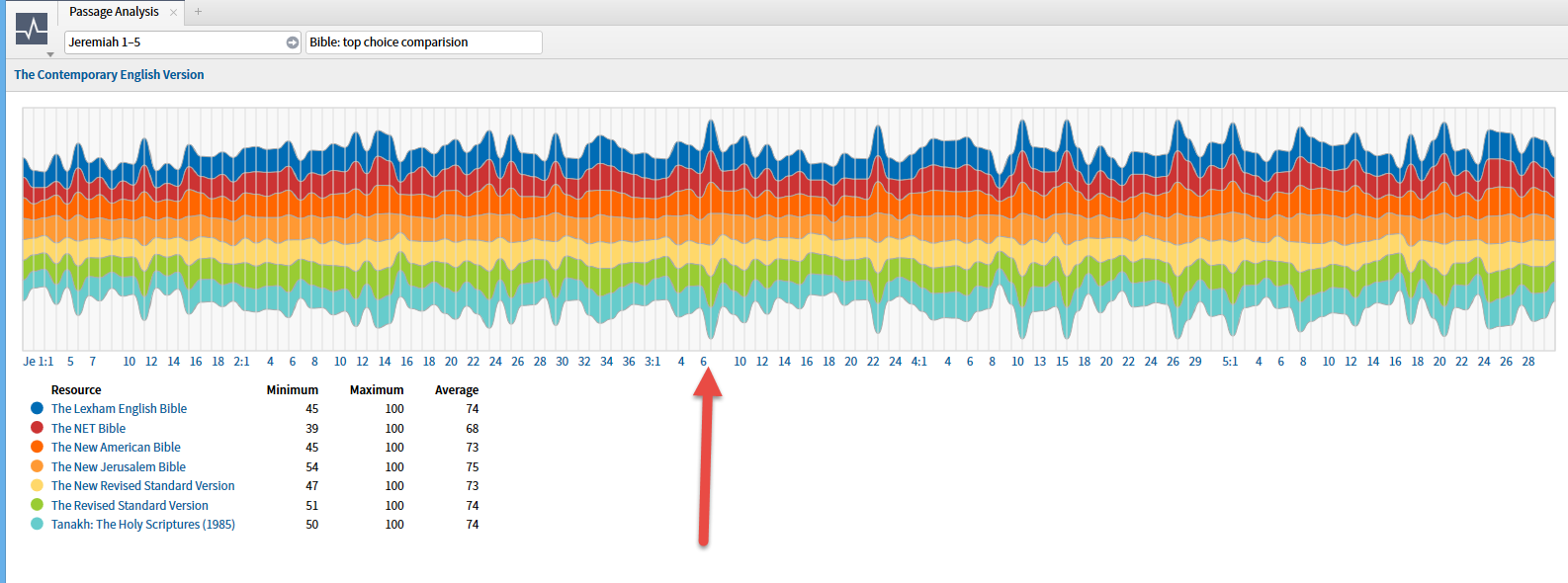
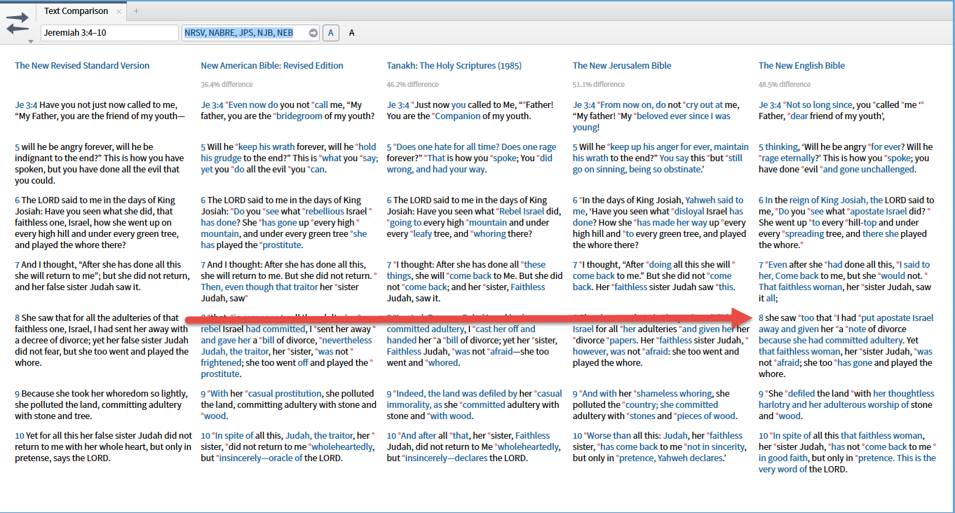
The first example that comes to mind is identifying where a different base text is used. For example the two versions of Jeremiah differ by about 1/8; the two versions of Acts differ by about 1/10. Where the spread dramatically widens is a good place to look for the differences between the two manuscript traditions. Note it took me less than 20 seconds to isolate an example.
I believe that the official name for this type of visualization is stacked bar graphs. They are frequently criticized when used for more than two items because each difference effects the display of everything above it.
I believe that the official name for this type of visualization is stacked bar graphs.
Nope, this is a stacked bar graph:
Note that there's no attempt to artificially interpolate points that don't exist between the discreet data points on the graph. That latter is the part we're taking issue with on the Logos rivers. Not that they are stacked. That's fine, and is quite standard.
Rosie ... they are both called stacked bar charts.
I have no interest in defending the choice of visualization. I'm only trying to get users to understand that it is a standard visualization technique in text analytics, that there is solid research behind the use of the visualization, that that research has taken the discreet issue into consideration and that it can be useful to those who are used to it.
From my perspective it is no different than the new character narrative maps.
What is the point of this feature? What does it do? I dunno.... It just looks cool.
[Y]
Let's not throw the water out with the baby. Whenever you want a quick analysis of a lengthy NT section, and then a super-fast drill down to word level, this would be it. I don't think the other big boys offer it. Hoping we'll see similar for latin.
..
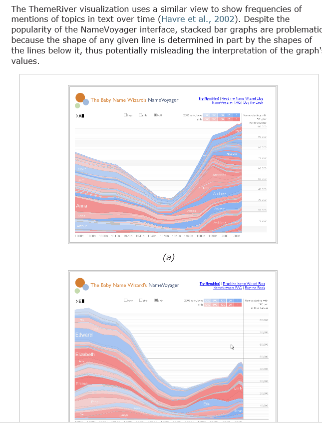
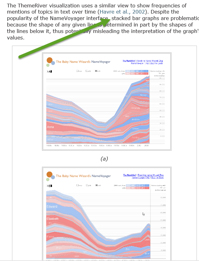
Ah, but MJ, the chart of baby names that you show above are a far different beast than the River charts. Notice how much more precise they are with carefully labeled horizontal and vertical axes? But lets not grind those axes, shall we?
The point is, if verse 12 has 4 nouns in the accusative case and verse 13 has 5, then the relation between the accusatives in 12 v. 13 is a simple step function ... it increases by 1. And this is easily and clearly shown by a stacked bar chart or other variations thereof. To show anything other than a simple step up from 4 to 5 is misleading.
This discussion reminds me of my preference in gardens compared to my wife's. I want precision, straight lines, clear demarcation between each variety of plant ... formal gardens. She, on the other hand, prefers rambling, non-linear edges and a more random, English garden style ... controlled chaos as I term it. Of course you know who wins that argument! Next time you visit I'll give you the tour of our English gardens.
You've probably noticed that I tend to be a precision-freak as well. However, I absolutely abhor false precision and am willing admit pragmatics in tools. However, my intent was not to be an advocate for the tool. When someone wants information on what a tool works and why you'd want it, that is the information I will try to provide. If you wish to understand why the visualization is not shown as discrete values feel free to read up on text analytics and unstructured text data mining and the cognitive perception tests applied to them. I have no trouble seeing why you would like to see discreet values. I also no trouble seeing why such information would be presented in a different format.
Let's not throw the water out with the baby. Whenever you want a quick analysis of a lengthy NT section, and then a super-fast drill down to word level, this would be it. I don't think the other big boys offer it. Hoping we'll see similar for latin. ..
Ah, but MJ, the chart of baby names that you show above are a far different beast than the River charts.
I agree ... their sole purpose was as an instance of the term "stacked bar graphs".
And why on earth would I want to use a verse as a distinct unit? It's as meaningless as reviewing a legal document by line number. Verse number/line number are units for reference not analysis. But you are correct that if the purpose of the chart was to show precise counts for precise units. this is not the appropriate visualization. But this is more of a data mining style tool - a quick way to focus your attention on a precise passage for you to use other tools to analyze with precision.
No. MJ, Rosie's got you on this one. The chart that shows discrete data is called a bar chart, or a stacked bar chart. The chart that shows continuous data is called a histogram. They are categorically (and thus interpreted) different(ly).
A) I am not in competition with Rosie - she could run circles around me explaining how the normalization formulas work on these charts.
I overestimated the inclination of forum users to read - see arrow. I happened to believe that it is important to understand the use of vocabulary by people in the field - I am not in the field. But to support the understanding of how vocabulary is used, I offered a "not only but also" example. Hmmm ... do my linguistic roots show?
C) I did not say they were the same - I said they shared the name. And no, I will not provide a lexical feature chart to show why ... well at least until Logos provides a nifty tool to do so[;)]
Are you trying to bring Fallacy hound out for a run around the forums? I've provided links and samples for people who are interested in textual data mining to follow up on the terminology, math and the why's and how's. I may have over-simplified to avoid a 20 hour introduction to basic unstructured text data-mining (but I did check my information rather than trust a rusty memory). But then again, I suspect Denise could run circles around my knowledge of the area.
Keep the feature if it doesn't hang systems or prove to be a distraction!
There are more important usability and functionality problems to solve now.
So now is not the time to suggest topic river?
I'd like that![Y]