TIP - Find Focus Follow Pt 6 - Elements of a basic study layout
This is a continuation of Pt 5 of this series.
Up to this point we have discussed the concept of Find Focus Follow, and have reviewed a few "gateways" into your library that may help you find and follow without losing focus. I want to break from gateways and discuss some ideas for you to consider in how you build and use layouts, with an emphasis toward Focus Find and Follow.
Often times I start with a basic study layout and then build on it for more specific studies. Having a basic study layout can be really helpful in thinking through more specific layouts. I have designed my concise study layout into four zones. On the left I have guides, center top my biblical texts, center bottom a space for all resources will open and on the right in a fixed window the Information Window, a Text Comparison, and the Cited By tool.
Here is a screenshot, note the red lettering designating the purpose of the various zones:
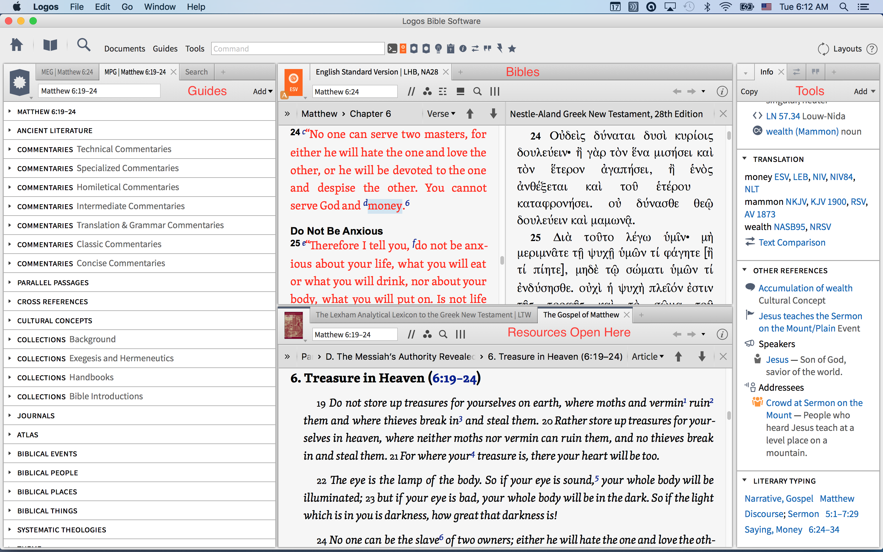
If you need more room you can always open and close the windows on the right as needed. I tend to keep the information window open, so having the other two does not take up any more space. I have shortcuts for these three tools on my shortcut bar so I can open them easily if I do not want them to stay open.
I do not like any resource to open and cover up my Bible, as I want the text in front of me during my entire study. Many of the resources refer back to the text and I want it open and available at all times. Hence, the center bottom zone.
The guides are gateways for me to find and follow. Depending on what I am doing I usually work from the Exegetical Guide to the Passage Guide. You can and should customize these guides to adapt them to what you focus is. There is an instructional video on this here. I also discuss this in detail here.
Lastly, I like to have a single search window that is designated "send searches here". This keeps the search window from opening all over the place. Want to see a one minute set up of this layout? Here is how I set this up.
While this works for me, you may want to make some adjustments/additions/deletions. Sometimes I put the Cited By tool on the far right, the compare text on the center bottom etc. The goal is to try and get a layout that lets you find what you want, explore where you are led and to not lose focus in the process. I hope this gives you some ideas on your own layouts.
Comments
-
Thanks John
I like that you have a Greek language bible opened by an English bible. If you were using two monitors, which window (s) would you float to the second monitor? Enjoying your posts.[:D]
0 -
Lonnie,
Great questions, and I often which I worked in a multi-monitor environment.
Here is what I would do:
Main layout: More reading room for Bible and Resources, guides still on the left.
Floating layout: Info Window, Factbook which Logos always reuses, and 2 text comparison windows (English and Greek or MT/LXX for OT)
I have found opening resources in a floating window inconsistent, so I personally would use the extra monitor as above. Let me know what you come up with that works for you so others can share your experience with multiple monitors.
0 -
Hey John,
I set up everything like what you have on your main screen. The only things I moved to a second monitor was the cited by tool, the information panel, and the search panel to send all searches too. I only floated one window to accommodate them on my second monitor. I first floated the cited by tool and then I added the search tool and the information tool to the same window. After putting them all on one floating window I spread them out into three columns on my second monitor. I like these three on a separate monitor so the ongoing population is not a distraction and they are bigger then the pane they open up in and easier to read. The only thing that I might add to the layout is the Lexham Clausal Outlines of the Greek New Testament to the pane with the NA 27 (28) in order to easily check out the syntax as I study.
0 -
I have found opening resources in a floating window inconsistent, so I personally would use the extra monitor as above. Let me know what you come up with that works for you so others can share your experience with multiple monitors.
I'll pipe in here. I have a small screen, a 13" MacBook Pro. I use overlapping floating windows to increase my workspace:
Main Window:
Bibles Window:
Resources Window:
In regards to the inconsistency of where the resources open, the size of the panels is very important. For example, if I make my search panel too wide, then resources will open there. You have to play around with the sizes of panels until you get the resources to open where you want.
Thanks for your tips, John, they've been useful for me.
0 -
Hey John,
I set up everything like what you have on your main screen. The only things I moved to a second monitor was the cited by tool, the information panel, and the search panel to send all searches too. I only floated one window to accommodate them on my second monitor. I first floated the cited by tool and then I added the search tool and the information tool to the same window. After putting them all on one floating window I spread them out into three columns on my second monitor. I like these three on a separate monitor so the ongoing population is not a distraction and they are bigger then the pane they open up in and easier to read. The only thing that I might add to the layout is the Lexham Clausal Outlines of the Greek New Testament to the pane with the NA 27 (28) in order to easily check out the syntax as I study.
Lonnie, sounds like a great layout.
0 -
Integ,
Thanks for your additional suggestions. I am on a 15" MBP and will give more thought to floating windows. I am glad the resource placement is not just OCD on my part. I have company...
0 -
I use overlapping floating windows to increase my workspace
Like John, I think this is a great idea to consider maximizing space.
Using adventure and community to challenge young people to continually say "yes" to God
0 -
Thank you John.. I create PBs of all these tips here..
0