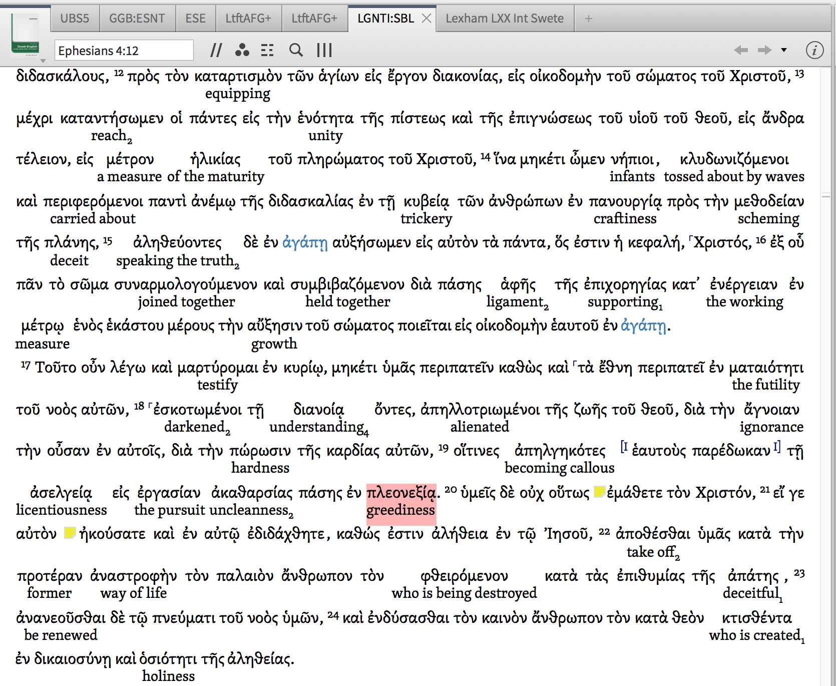
Hey guys,
Is this how the Interlinear is supposed to look?
It's pretty hard to read!
It would be a lot easier to read if I could make the interlinear lines a different font, smaller, and lighter in colour...
Well, ignoring the greek issue, and the sparse glossification, if you had Libby, you could re-order the lines. Yes, you read that right. Powerful software (periodically).
I agree.
One another possibility is to have different font in the manuscript line, currently possible in Greek but not in Latin.
And user.definable line spacing could also help.
Is this how the Interlinear is supposed to look? It's pretty hard to read!
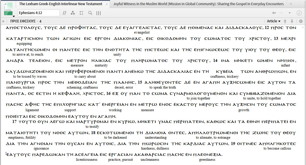
The sparse glossification is due to the filter Reader's Edition; and this contributes significantly to your issue. You can
Thanks Dave, all of that is helpful but seems to undercut the point of the readers interlinear.
i know Logos cares about typography. Maybe someone can give this some love?
Available Now
Build your biblical library with a new trusted commentary or resource every month. Yours to keep forever.