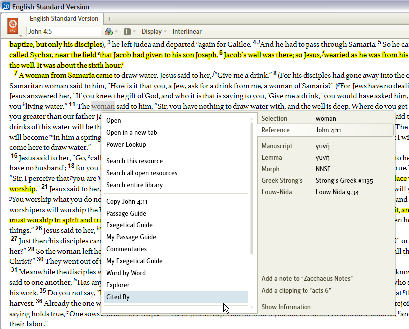
Add to Passage List menu option off the bottom of the menu
Todd Phillips
Member Posts: 6,736 ✭✭✭
On my computer, there is too much stuff on the left-hand side of the "reference" tab of the pop-up menu. This causes the "Add to passage list" option off the bottom and requires scrolling. I think the context menu needs work in general, but could something be done about this? Maybe put the option on the right with the other "Add..." menu items?
I don't really want to delete any of my guides, but they are taking over the menu. I hesitate to ask for a hierarchical menu for them, since Bob is against those, but maybe it's what's needed.
MacBook Pro (2019), ThinkPad E540
0
Comments
-
-
+1 [Y][Y]
Somehow I had missed this post when I posted this comment to another thread. Yes, I heartily agree!!
0 -
-
Todd ~ I've requested this. Thanks.
0
This discussion has been closed.
