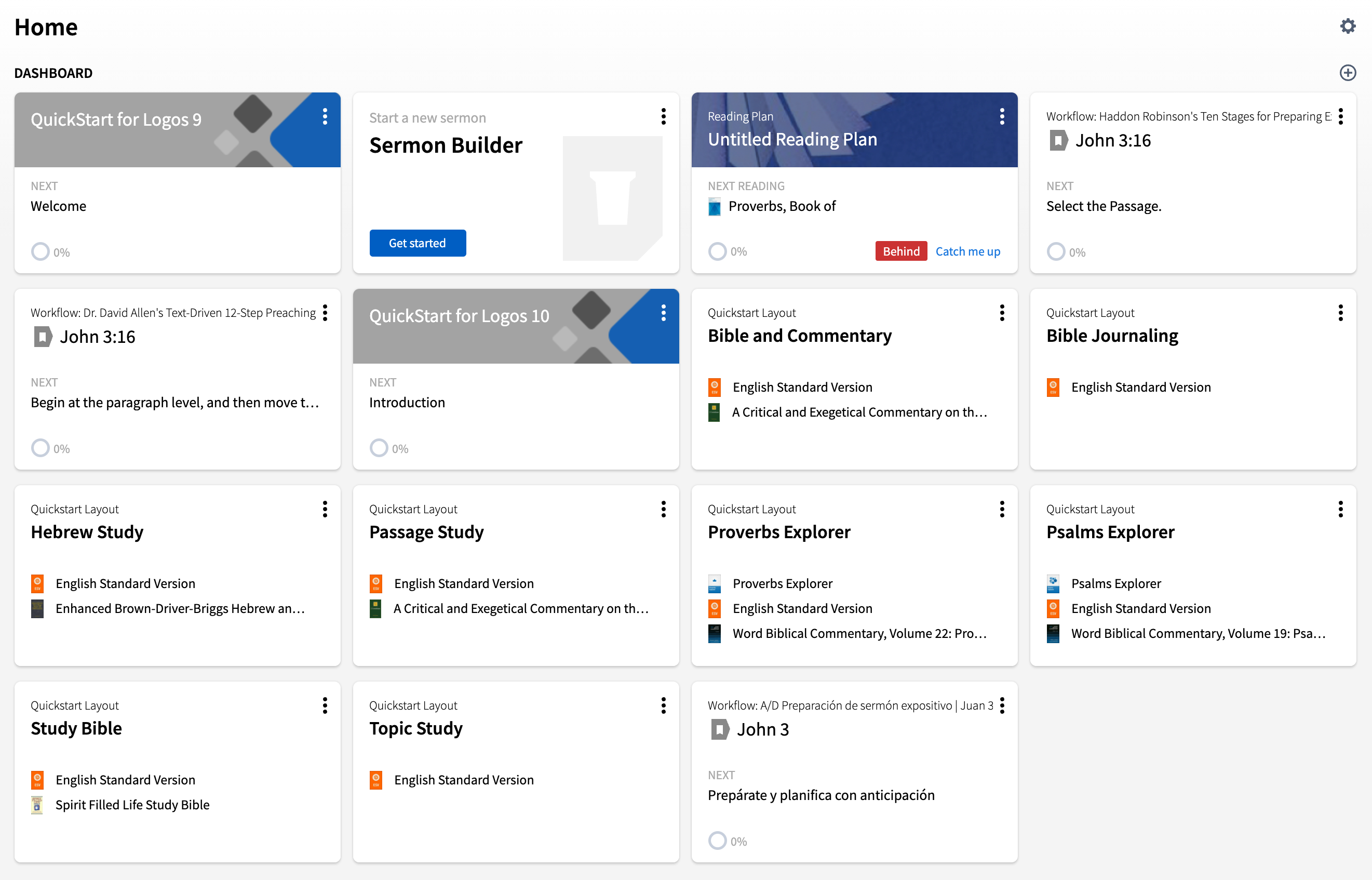
What do you think of QuickStart and Home Page layouts?
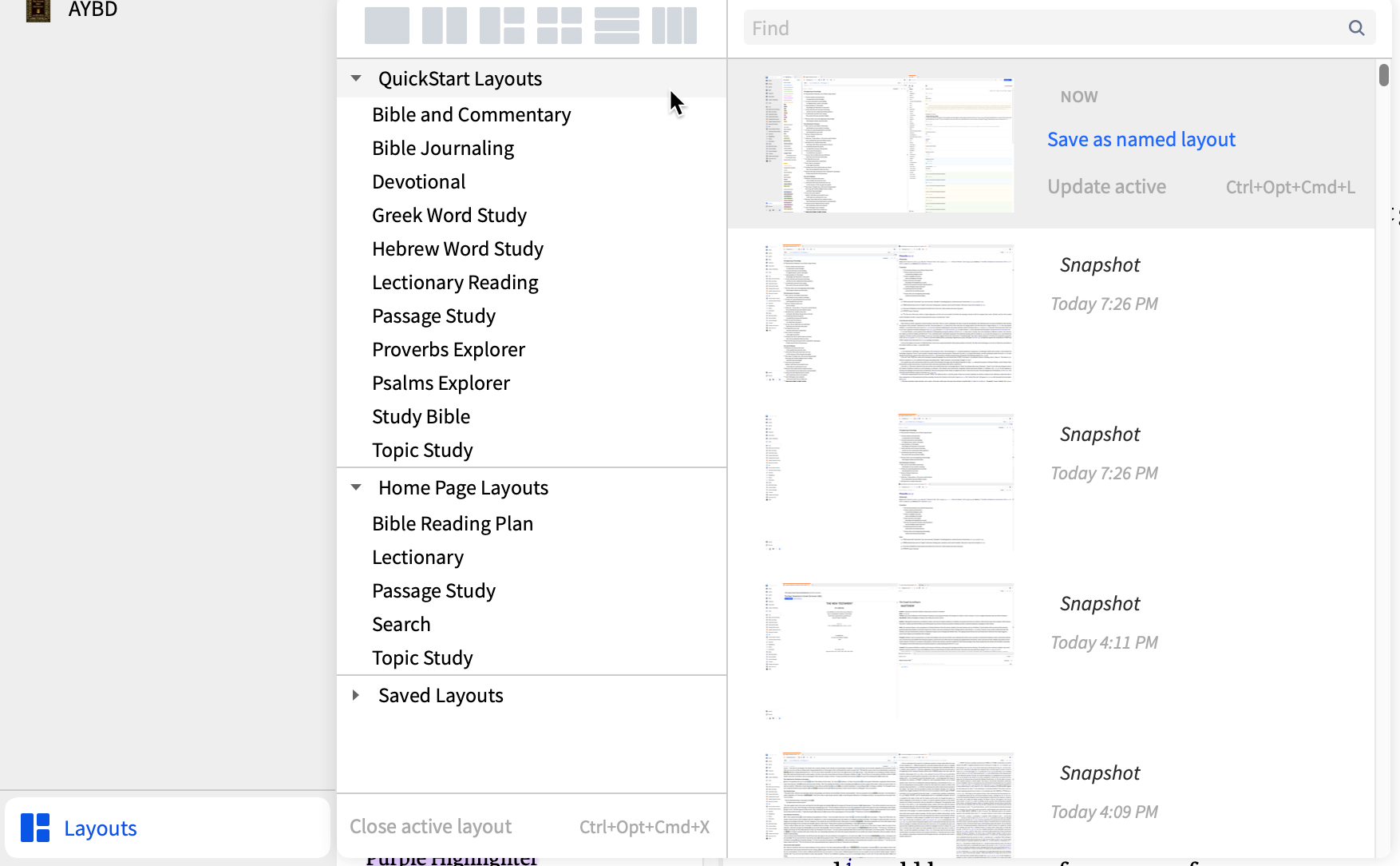
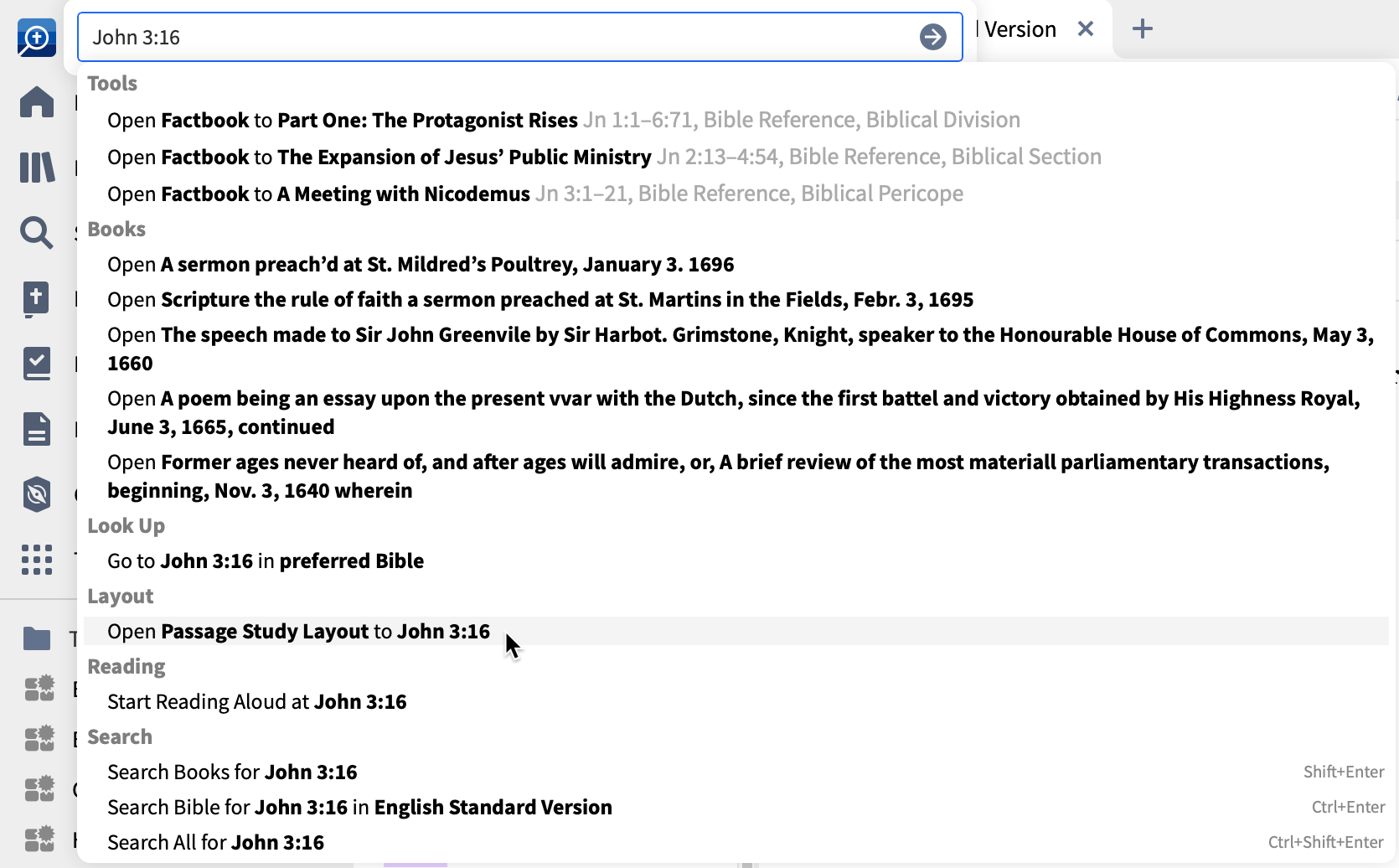
I'm giving a little bit of thought to QuickStart and Home Page layouts. As illustrated below, these are accessed in three places:
- The layouts menu
- The command/Go box
- The home page
Do you find these layouts helpful in principle? Do you think the layouts we have open the right resources in the right places? Are there simple, beginner-friendly layouts you think we should add?
Comments
-
Sorry I haven't used the layouts on the desktop app. I just have an ongoing layout that I keep adding/subtracting books based on my needs. I have the Logos app open whenever my laptop is on.
On the web app, I tend to use the pre-made layouts because I usually only use the web app for a specific quick task when I can't use the desktop app at the moment for whatever reason.
0 -
I use the passage study layout quite often, but I have modified it to my taste.
I use layouts daily, but most of them are my own.
Gold package, and original language material and ancient text material, SIL and UBS books, discourse Hebrew OT and Greek NT. PC with Windows 11
0 -
Mark Barnes (Faithlife) said:
- The layouts menu
- The command/Go box
- The home page
1. Use the layout menu almost daily. Very convenient. Switching between layouts is almost instant. I do not use the preconfigured ones, no need.
2. (Almost) never use the command/Go box. Too much info in a cluttered way. Not helpful for me.
3. Never use the home page. Not useful or helpful for me. Can't think of any advantage for me.Remark: looking at the three screenshots it occurs to me that the menu's are showing a lot of information. Perhaps an idea to focus on the most important three or four and hide the others under a clearly visible "more" button. Less is more..
0 -
I use custom layouts the most. I sometimes start with a Home Page or Quick Start layout if I am starting some new type of study, and then customize from there.
I love the Home page. I have books, devotionals, calendars, and reference material in the top part, and I have most categories checked in the Explore section, as I like to scroll down and see what's new all on one place without having to click anything except when I want more info (or to grab a Prepub, read more of a blog, etc.)
I wish the Home Page automatically updated to the new day - I leave Verbum up all the time in its own window, so in the morning I have to click on a resource, "Close all" to get the Home page refreshed and in the position I Had it in before (I actually have the Explore section near the top so I can see more of it - a Close All resets the Home Page to the very top.
Scrolling down the Home page, especially in the Explore section, is VERY slow. Sometimes I wonder if it's frozen.
Today in History is great - how about some more Catholic references? I read them all.
Aesthetically, I much prefer the smaller windows then when there is some rather silly graphic from a blog or something that takes up 2-3 columns wide. Yuck.
Other than that, the more pleasing it can look (professional colors, layout, uniformity in size, etc) the better!
0 -
I use them only from the layout Menu.
I currently have only one of them customized; I use many personal layouts as well.
There are some layouts I am surprised to see on the list but none that I consider a waste of space. There are some layouts that I would expect to see that are not present:
- The Anglican equivalent to the lectionary layout
- a study guide/Bible layout ... for the entry level lay Bible student/small group student
- a Thompson chain layout
- a Complete Biblical Library layout
- a few workflow oriented layouts
I would like to see the Home Page/Quick Start distinction ditched and a pin to top feature as in Tools implemented. I think Layout Template | Faithlife is worthy of consideration.
Orthodox Bishop Alfeyev: "To be a theologian means to have experience of a personal encounter with God through prayer and worship."; Orthodox proverb: "We know where the Church is, we do not know where it is not."
0 -
I never open the home page. I start my study with the last open layout. I also have all my own layouts, but started to build them using some of the prefab ones in the layout drop down.
I think they can be great starting points for new users that want to see how a layout can assist in workflow.
I rarely use the command box and never to open a layout.
0 -
I use the command box because some things can only be done that way (e.g. set x to y; update now).
I rarely use the home page. No need to.
0 -
1) I almost always use my customized layouts built from scratch. Yet, I appreciate the others being there for inspiration or examples of something else to try, ideas to organize windows in another way, etc. (This is analogous to a synthesizer's presets, if that makes any sense. )
2) I use the command/Go box frequently, but mainly when another way of getting to where I need doesn't exist in a window that's already open, or when an available symbol isn't nearby.
3) I don't use the homepage often. I get emails and read forum stuff enough that I don't learn much about what's happening from it. Yet, I will occasionally go there when I'm between things for unwrapping some books I wouldn't ordinarily go to instinctively. That is, I use it in a manner similar to FSD.
0 -
Mark,
I appreciate how you often ask how we use certain functions of Logos. When you do this, it shows me that you are interested in what us users are actually using and working with. I remember you did this with Search last year... and then Search got greatly improved. I am especially thankful for that. Kudos to you for all this.
As to layouts... I'm mostly a "roll your own" type a guy. I have about 4 layouts that I work with regularly. I did not know there were "canned" layouts... but now that I know it, I will look into them.
Again, thanks for your work!
xn = Christan man=man -- Acts 11:26 "....and the disciples were first called Christians in Antioch".
Barney Fife is my hero! He only uses an abacus with 14 rows!
0 -
1. Layout menu
I guess. Like some, I never looked at it. But if I were new, it's not obvious what they are. There's nothing that prevents explanatory text to the right. And 'QuickStart' is meaningless; QuickStart would be its own main UI button (for newbies). I would lay odds, most users don't know what 'Replace with Current Layout' is (ie the section can be used for named layouts, I presume, from Help).
2. Command/Go.
Personally the design is a disaster. I'd let the user select what they want (eg a customize button), instead of the crazy 5 tries, and scan down the long list for something you want. For me, commands (a LIST). I never remember the command syntax.
3. Home Page
Like most (on the thread) don't use it. Used to. Looking at the current version, I don't do the top section. I'm offline for the bottom section. I do like the Excerpt section but don't use it ... can't select excerpt sources (collection, tagged, type, etc). Don't need excerpts from all the books that get dumped in my library (buying packages).
But worse, if you don't want a major section, you're stuck with it (the top just stays there, in my case). And finally, every time there's a major update, you have to go in and kill the ones you don't want. Leave it alone and put up a banner for new, if that.
0 -
The first time, and the first time after a break of four weeks, the Layouts menu opens the program should display a panel linking to the instructional videos showing the use of layouts.
The panel should be dismissible with a single click. Most competent users would only see the panel once.
tootle pip
Mike
How to get logs and post them.(now tagging post-apocalyptic fiction as current affairs) Latest Logos, MacOS, iOS and iPadOS
0 -
I looked at the home page once, and never used it. I'm always set to reopen my last-used layout. I have also never used the quick-start layouts. That may be a function of me using Logos for a long time (though far from a power-user.) I suspect they would be useful to new users of the software.
"The whole modern world has divided itself into Conservatives and Progressives. The business of Progressives is to go on making mistakes. The business of Conservatives is to prevent mistakes from being corrected."- G.K. Chesterton
0 -
Mark Barnes (Faithlife) said:
Do you find these layouts helpful in principle?
Yes. But avoid the duplication of Passage Study and Topic Study. There are legacy reasons for adding QuickStart to Home Page layouts but there should only be one. I dislike the quirky QuickStart vs Quick Start name.
I modified HP/Passage Study and Bible Reading Plan but the differences were minor (added Highlighting with Info on Passage Study). Did not like QS/Passage Study at all.
HP/Topic Study has too many Guides and Dictionaries, but it does include Topic Guide which is needed in QS/Topic Study (and I would separate the multiple books).
Modified Greek Word Study by having separate bibles vs multiple books.
Dave
===Windows 11 & Android 13
0 -
Thank you Mark, for keeping your finger on the pulse of the Logos user/client base.
Like many others, I never use the Home page and rarely touch the Command Box. I've glanced at the QuickStart layouts a few times from the Layouts menu, but so far I've just used my own. I think the QickStart layouts can be great for new users though, and I like knowing they are there for my own potential future reference/inspiration.
0 -
- I use the layout menu fairly regularly, as I have different layouts for different topics and projects. Sometimes I use the Quickstart layouts to begin a project and then rename it to fit the project. I think the current Quickstart layouts also work well for those new to Logos.
- I use the command/Go box every week, particularly in searching dictionaries through Factbook for word definitions to use in Sunday School lessons.
- I use the home page every day. I have my long-term project layouts docked to my dashboard and use the home page to switch between them.
Above all these things, walk in love, which is the bond of perfection. - Colossians 3:14
0 -
I share this sentiment, thanks for checking in with users!xnman said:I appreciate how you often ask how we use certain functions of Logos. When you do this, it shows me that you are interested in what us users are actually using and working with. I remember you did this with Search last year... and then Search got greatly improved. I am especially thankful for that. Kudos to you for all this.
Alright, here are my many thoughts. I trust you guys are wise enough to take what's good and ditch what's not.Do you find these layouts helpful in principle?
- Do I find layouts helpful? Absolutely, they are an incredibly helpful feature.
- Do I find the QuickStart layouts and Home page layouts helpful? Yes, I think layouts are possibly the most important and helpful way for new users to get to grips how to use logos, the resources, and the tools. For example, I got to see and use resources and tools linked together for the first time via layouts. One nuance, I graduated beyond using the quick start and home page layouts fairly quickly, and now almost exclusively use my own custom layouts. However, the quick start and home page layouts were instrumental in showing me how I could use and display my resources/tools, and I would refer back to them regularly to see if there was things they were doing that I wanted to integrate into my own layouts.
Do you think the layouts we have open the right resources in the right places?
- Generally, yes. I think the QuickStart layouts and home, page layouts open the right resources in the right places
Are there simple, beginner-friendly layouts you think we should add?
- Yes! I've tried to select layouts that showcase features/advantages of using bible software over analogue pen/paper. Also selected features that I think are really helpful or useful for new users to be introduced to.
- Resource Reading Plan: Similar to the Bible reading plan, but the idea is it introduces the users to the concept of reading plans and note taking in resources other than the bible. It would have the main resource open, plus the reading plan, notes and highlighter tool. John Bunyan's Pilgrim Progress might be a good resource to use, it's out of copyright and an edifying read.
- Parallel Gospels: Being able to display parallel gospel accounts at the same time is one of the coolest things we can do with digital bibles! To do the same in paper, you either need to purchase a dedicated resource like Kurt, have multiple physical bibles, or do a lot of page flipping. Let's showcase this, plus add in a study bible and notes for good measure.
- Course: Again, designed to get new users into the idea of how they might use logos to do a course. Have the course open on one side with the appropriate resources on the other. Not much thought has gone into this layout on my end yet…
- Original Language Reading: The current original language layouts are focused on word studies, which is helpfulish. However, many new users are seminary students - and when you study language at seminary or college they are doing much more then word studies. These new users need to see how they can use logos for translation, which means using the textual apparatuses etc. I also have 'cited by' opening up any grammars that reference the passage.
- Original Language Vocab: Similarly, new college users are very often learning vocab. Let's introduce them to the pronunciation tool, and morphology chart. Both very helpful tools that are underutilized. I've added the pronunciation tool for obvious reasons. But the morphology tool allows me to see immediate usage of the word in different contexts, very helpful when I want to practice translation. A lexicon is there so I can see how a word might be translated.
Other thoughts...
- I think the current access via layout menu, command box and home page is more than sufficient. I suspect almost everyone uses the layout menu, hence it's prime position on the toolbar. Access via the command box doesn't add much for most users, and I'd be tempted to remove it from the options to help de-clutter the results (or at least have the option to disable layouts appearing in results). Adding 'update active layout' to the toolbar would also be very help for me.
- Home access would be helpful for people who open home as their default, and the advantage of accessing layouts via home is that you have some idea of what resources are being used in the layout. Two suggestions however. First, only resources used in the layout are displayed, not the tools or interactive media etc. If I am to have an understanding of what the layout does beyond the title, listing the tools and interactive media in use would be a big help. Second, only primary resources opened are listed - resources opened via 'multiple book display' are not listed. Almost all of my layouts have 'multiple books display' permanently enabled on a panel somewhere, and seeing those resources listed along with the other stuff when viewing layouts on home would be helpful.
- While we are on the topic, allowing users to customize the layout card title header would be very helpful. We see this already on some cards. Even if we simply had different shades/colours, it would allow me find and select what I'm after much quicker. Your picture of the home dashboard shows the issue mark, I potentially need to 'read' a lot of things before I find what I want. But if for example I decided that the 'psalms explorer' is green and the 'topic study' is gold, I can find and select those much quicker amongst the sea of words that is my home screen.
- As others have said, the QuickStart/Homepage layout distinction is pointless and potentially adds confusion. Have them all under one heading.
- Consider offering academic layouts which come with the academic essentials package or something
- Multiple layouts open at the same time? Being able to switch between layouts like how people have multiple desktop would be helpful for people like me - I tend to set up my layouts to perform discrete functions and switch between them like people switch between MS Office applications. To produce a bible study or a sermon, I might use 3-4 different layouts.
Current MDiv student at Trinity Theological College - Perth, Western Australia
0 -
I like the layouts and the home page because it is like a synthesis of data waiting to be exegeted. I am empathetically pleased of the removal of the green GO box. That was hard on me and made my vision fuzzy over time. This newest update created a simplified layout that reduces distractions. Before the newest update, I was always set to reopen my last-used layout. But now the home screen is more simplistic. Like Dave, I avoid the replication of Passage Study and Topic Study layouts. Allowing users to modify the layout card title header would, in my opinion, make access much easier and be really beneficial.
0 -
I wish I could create a layout of 'resource type' locations so I could set where each type of resource or app opens. For example, I would like all Bibles and search panes to open on the left and all commentaries, notes, clicked search results to open on the right. I would like this to not be linked to a specific resource that I have to keep updating every session for it to keep up with me.
0 -
I like the QuickStart and Home Page Layout categories I just wish they could be listed below my Saved Layouts.
Someone mentioned a readily available "Update Active Layout" button and that sounds like a good idea to me.
The idea right above my post regarding being able to designate where resources open is a super idea, also.
0