This appears on the Logos application main page. Instead of Logos taking action, the suggestion is to post on the forum page.
I would encourage Logos to follow the same Bible markup that anyone that respects the Bible would use.
Er..ah.. what you are showing is highlights applied by the user. Are you asking that Logos get a better class of users? (joking). Logos does not control how users' mark up their books, but it does allow users to turn off highlights in the resource menu.
My apologies - I had no clue as to the context.
Hi @MJ. Smith
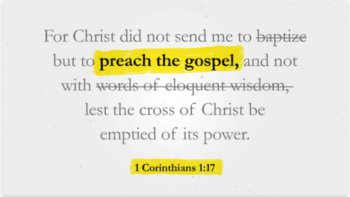
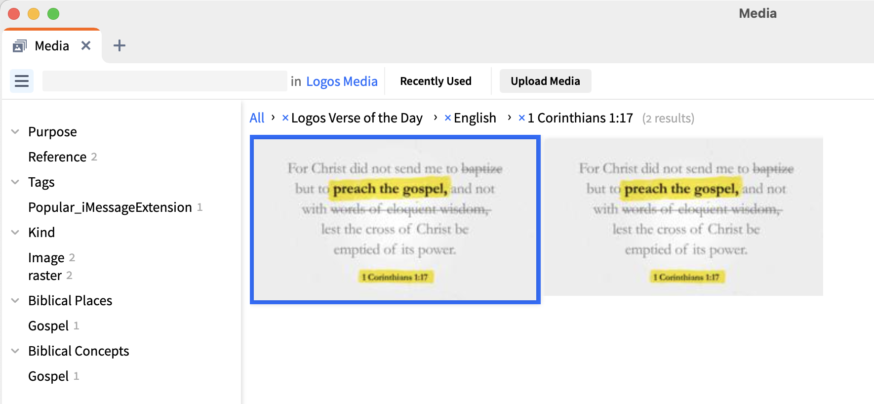
It's not user markup - it is one of the pieces of media in the Logos Verse of the Day series
Well, it does suggest an interesting search, Paul NEAR baptism. I'd hate for the AI engines to come to a conclusion.
Those "Verse of the day" graphics are supposed to illustrate the verses visually. In this case they tried to do that by crossing out (but keep readable) the actions that Paul said he did not do. That is all this illustration is trying to do. I actually liked this when I saw it first and I never suspected Logos trying to remove anything from the Bible. Maybe it looks differently for you, but I am sure there was no ill intent. But it's helpful to hear that others perceive this kind of illustration in that way.
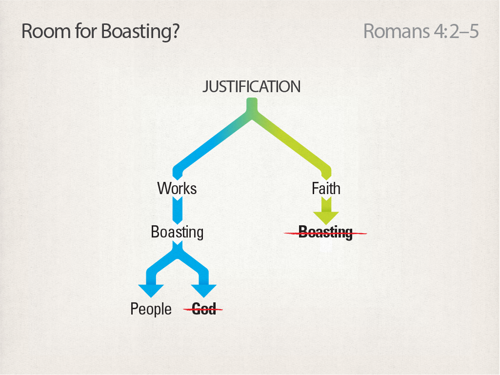
If you own any of the High Definition Commentaries from Steven Runge, published by Lexham/Faithlife, have a look at those. He sometimes uses similar ways to illustrate what the Bible says. Here is one example:
Available Now
Build your biblical library with a new trusted commentary or resource every month. Yours to keep forever.
I know logos is able to print up flash cards, BUT can we get a tool that does flash cards?! I’m envisioning a simple displays Hebrew/Greek/Aramaic/Ugaritic/etc. word then touch screen/click, ‘turn’ card then definition. I don’t know how this doesn’t already exist. Ideally this would include frequency word lists that we…
The static set of Reading Plans are insufficient and the ability to create our own custom reading plans is needed. Reading plans need to be self-created, customizable and sharable with others. A reading plan keeps one in the Word, but linear or sequential and fixed time-frames is not flexible enough. A reading plan should…
Logos might consider bundling commentaries that are specific to a book or area of study. For instance, if a pastor or Sunday School teacher were considering teaching through "Genesis", a single package could exist where many of the relevant commentaries might be found. This way a person could build a gradual library of…
As an Active Duty service member Logos (which I have spent thousand on) has become mostly useless to me since the migration to the Subscription model. Because SO many of the features I was able to use OFFLINE with Logos 10 are now attached to Internet Access availability ONLY. I understand that AI features will require…
Please make it possible to have different font options in Sermons and Bible study.