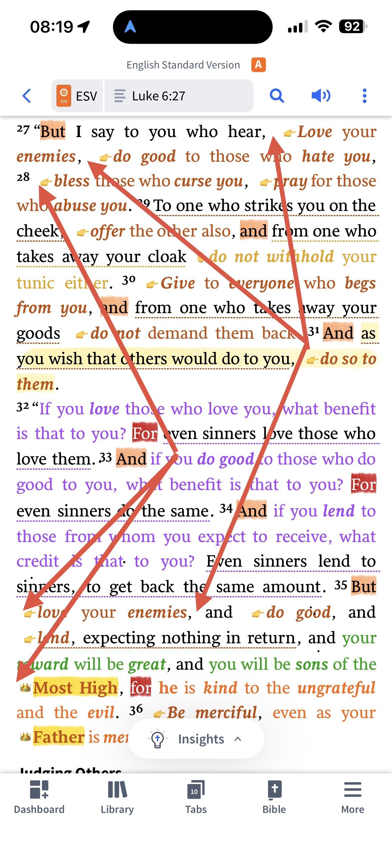
As can be seen the fully justified text produces unsightly gaps in the text, and this is made worse by the large gaps placed in front of icons applied to text. As I’ve requested before, please can both of these issues be addressed? That is, provide the option for ragged-right text alignment and remove the additional space added in front of icons applied highlight styles. This should not be hard to achieve and would align well well Logos’ otherwise beautiful typography and attention to detail.
And, as I have mentioned previously via emails, when icons (or background highlights) are applied by highlighting styles to text on the first line of a chapter, they are (way) too large vertically, taking on the height of the large chapter number and not the text they are applied to.
I truly love Logos and use it daily (for 3+ hours per day) and would (dearly) love to have these typographical issues resolved. I’ve spent a great deal of my life typesetting books and the issues mentioned grate constantly and, not infrequently, cause my eye to jump back and look at them, detracting from reading. Yes, I could just turn off all highlighting, but that would defeat the purpose.
You guys chose a beautiful typeface and have put so much care into Logos’ typesetting that I have to believe that these details matter to you (?)
Logos is a superb product and I delight in using it daily, yet the lack of response and (seeming) “tone-deafness” on these issues is discouraging. Does Bob Pritchett, who used to care deeply about typography, still provide any input? If so, I would love to hear his thoughts.
